
CareerBuilder
Mobile “Job Seeker” App Revolution
In this mobile app case study, we delve into a pivotal journey where my role as lead designer and interaction designer played a central role in shaping the future of an augmented reality job seeker app. The backdrop was marked by a transformative shift in leadership vision, ushering in a new era of innovation, and a CPO with a bold vision for the app's evolution. However, this vision clashed with the reservations of longstanding legacy stakeholders who ardently resisted the change. With our job seeker demographic increasingly using mobile devices, we prioritized improving mobile web and app experiences. To achieve this, we formed a dedicated mobile platform team. Here we navigate reconciling contrasting visions and revitalizing the app for a changing mobile landscape.

Goals
Business Goals
The jobseeker business is built on a continual flow of quality candidates that add fresh new resumes into our databases. The majority of our jobseekers have gradually shifted to mobile devices to perform their search and applying process. The organization wanted to increase this flow of quality candidates into the system and placed an emphasis on the hourly jobseeker.
Hourly workers make up 60% of the American workforce and account for 80% of all hires in the U.S.
From “Hourly Workers: The Economy’s Backbone, Not America’s ‘Poor Man’” by Peter Harrison, published on LinkedIn.

User Experience Goals
Our goal was to create a unique new mobile app that would enhance the user experience by allowing jobseekers to confidently complete their tasks faster. We would need to address key issues related to registering, uploading a resume, finding a job, and applying.
Of U.S. adults making less than $50,000 a year, 71% own a smartphone, and are more likely to rely on smartphones for online access.
Data from “U.S. Smartphone Use in 2015 “ by Pew Research Center
External Constraints
Our progress and direction would be shared during a board meeting within a few weeks.

Our Process
Our process needed to be flexible depending on the situational constraints. The design asset below addressed the three most important aspects of the ux process – discovery, design exploration (including iteration), and validation. This is how we worked through the proof-of-concept for the jobseeker app.

Paper Prototyping
1. Discovery: Understanding the Problem
During the predesign phase we wanted to better understand how we could better improve the user experience through competitive analysis and heuristic evaluation audits of the current app. How do we improve the experience with new features that improve user task completion? Also, do these solutions help to address the business goals?
Insights From Generative User Research (on-sight)
Users are willing to apply, interview, and be hired on the spot – same day
Like to be meet people and “shake hands” – on location job search
Frustrated when stores said “now hiring” but would make candidates apply online – pain-point
2. Design Exploration / Iteration
Here we take our direction from the exploration phase and try to address the problems uncovered. As a team we brainstormed, whiteboarded, and wireframed solutions. These solutions would then be put in front of our hourly jobseeker audience for future validation testing.
3. Validate with Users
During our initial guerrilla testing we garnered insightful feedback from users. This helped to improve our design discovery solutions, throw things out, and even revisit our initial problems.
Quality Surfaced Jobs
Jobseeker Wants (Onboarding)
During our user research testing a consistent paint-point emerged. User’s often commented that the jobs being presented in their initial search were not relevant. Also, our system would surface (through the app) or send (through email) job recommendations that would be off the mark. These poorly matched jobs would negatively affect the user experience and damage trust with the product.
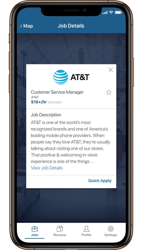
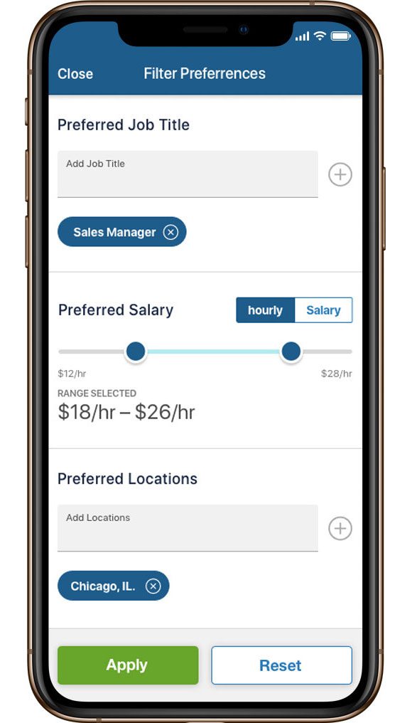
How do we surface jobs that better match the user’s wants? Our solution centered around job preferences that would be a part of the onboarding process. These four simple questions – job title, wage, distance, and location are instrumental in customizing our recommendations for the user. These preferences would be saved to the user’s profile and could be easily accessed if the user chooses to update.
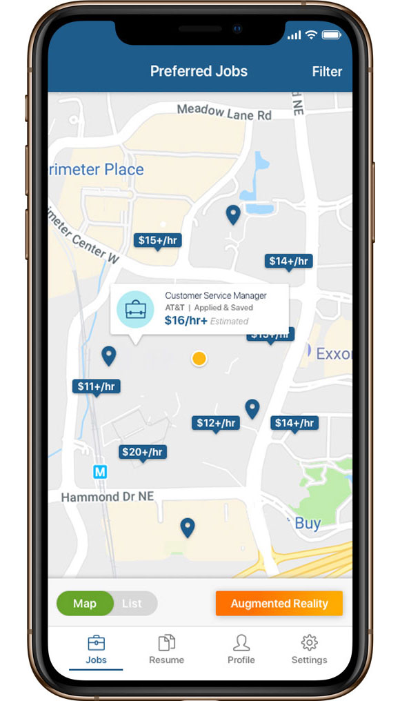
Better Location Based Experience
Job Seeker Proximity Map
Location and map functionality is table stakes when it comes to searching for a job. User’s expect to see relevant jobs in relation to their home or frequently commuted area. We reflected this importance in the content hierarchy on the jobs dashboard. User’s would be able to access the map that would highlight jobs that match their job preferences (jobseeker wants – job title, wage, distance, location). Also, the user can toggle to a list view and access augmented reality view if available.
Proximity Map WireFlow
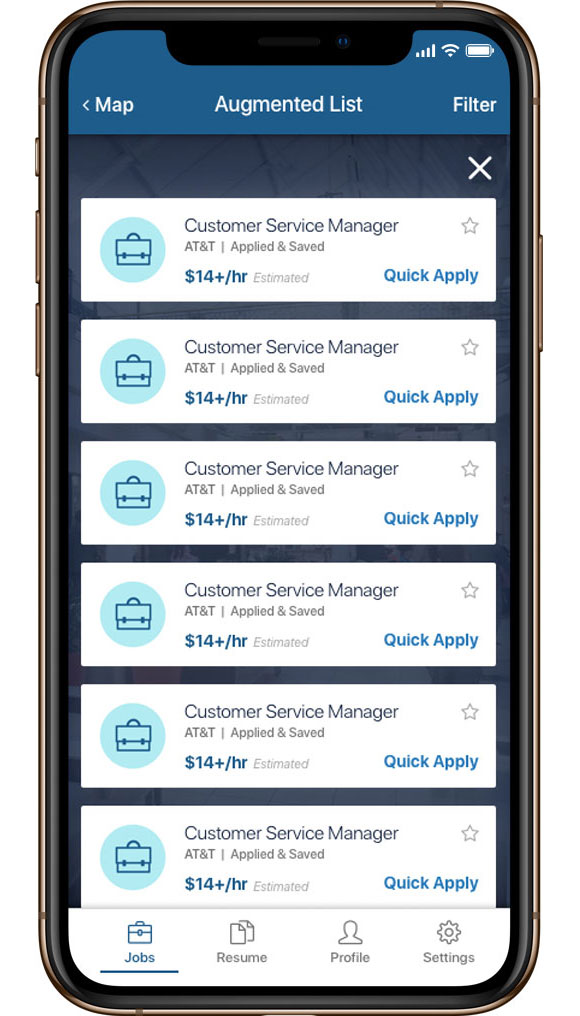
Augmented Reality
A unique selling point that helps to differentiated us from our jobseeker app competition is the augmented reality functionality. Hourly jobseeker are consistently looking for new or multiple opportunities. This functionality allows users to see available jobs that match their wants within a walkable distance (1 mile radius). Our augmented reality functionality compliments our map and gives users a new way to search for jobs in their environment.
Augmented Reality WireFlow
High-Fidelity Screens
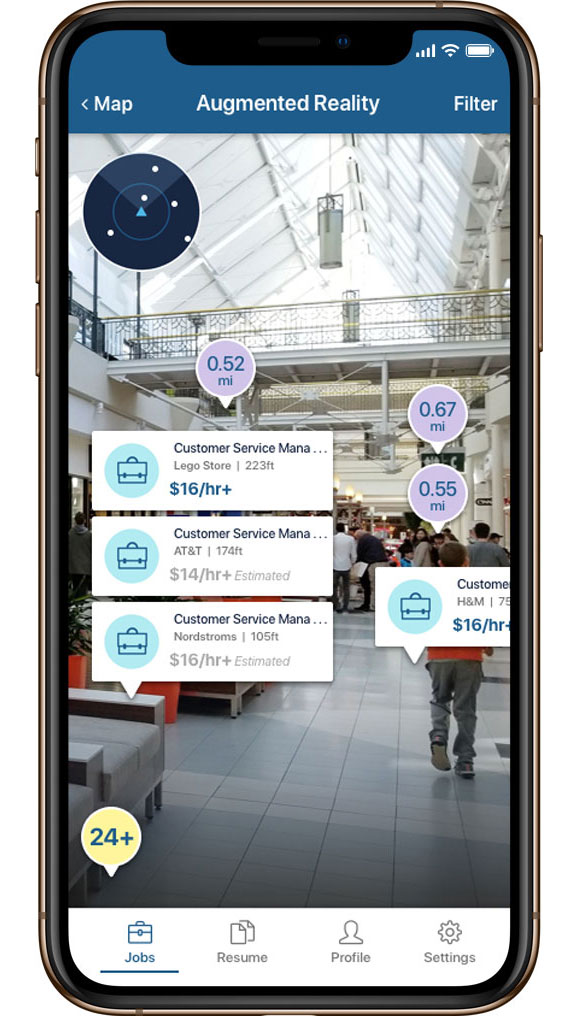
Augmented Reality Concepts


Augmented Tracker
This functionality would guide users to the selected job. Safety concerns arose with the potential of users walking and holding their mobile device in front of their face. This action would obstruct their view and we felt that augmented reality should be used while stationary.
Augmented Map
Another idea that was explored but not fully flushed out by engineering. The return on investment wasn’t worth the exorbitant time spent creating new functionality that had already been solved by the proximity map.


Standards A/B Testing
Goal
To validate standards design direction and push the existing design within the legacy jobseeker legacy app. With the ultimate goal of improving the user experience by redesigning the existing app to meet the validated standards. We collected feedback on various aspects of design including colors, ease of discovering information, spacing, and overall layout of the screen.
Testing Structure
Three separate sessions were held to show the designs for Notifications (Dashboard), List View and Jobs Detail Page. Each participant was asked a set of both Qualitative and Quantitative questions for each design to identify counts and trends. Three unmoderated UserTesting.com sessions with 10 participants each.
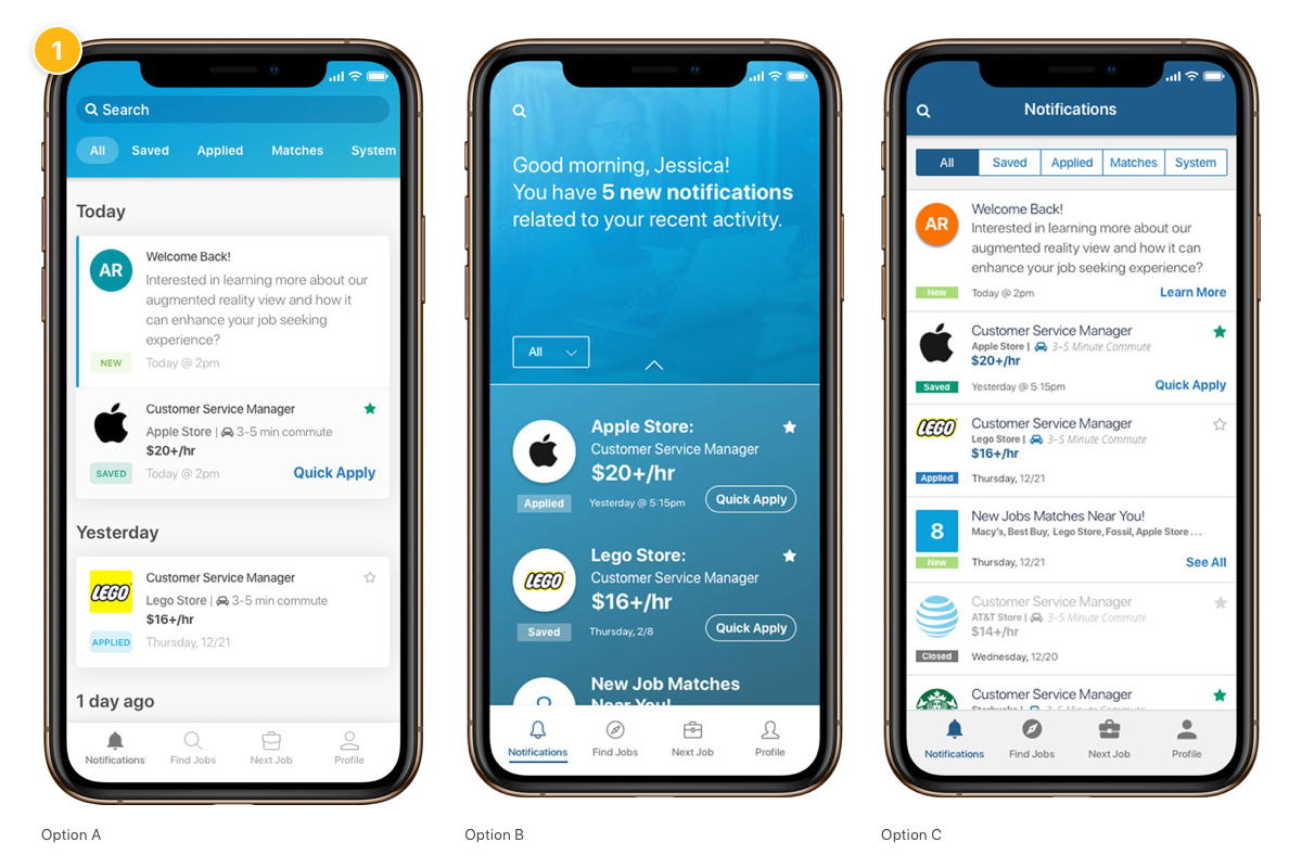
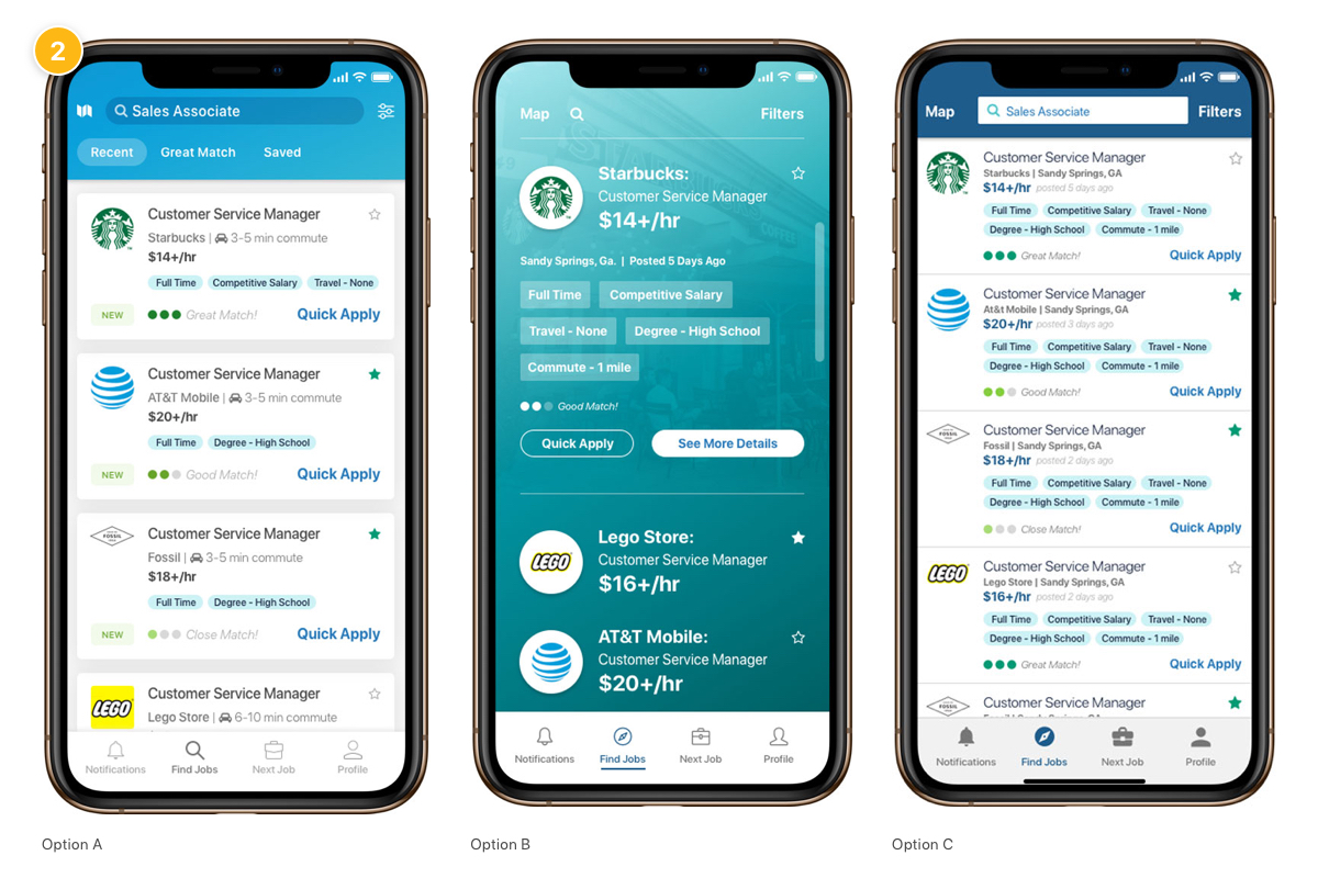
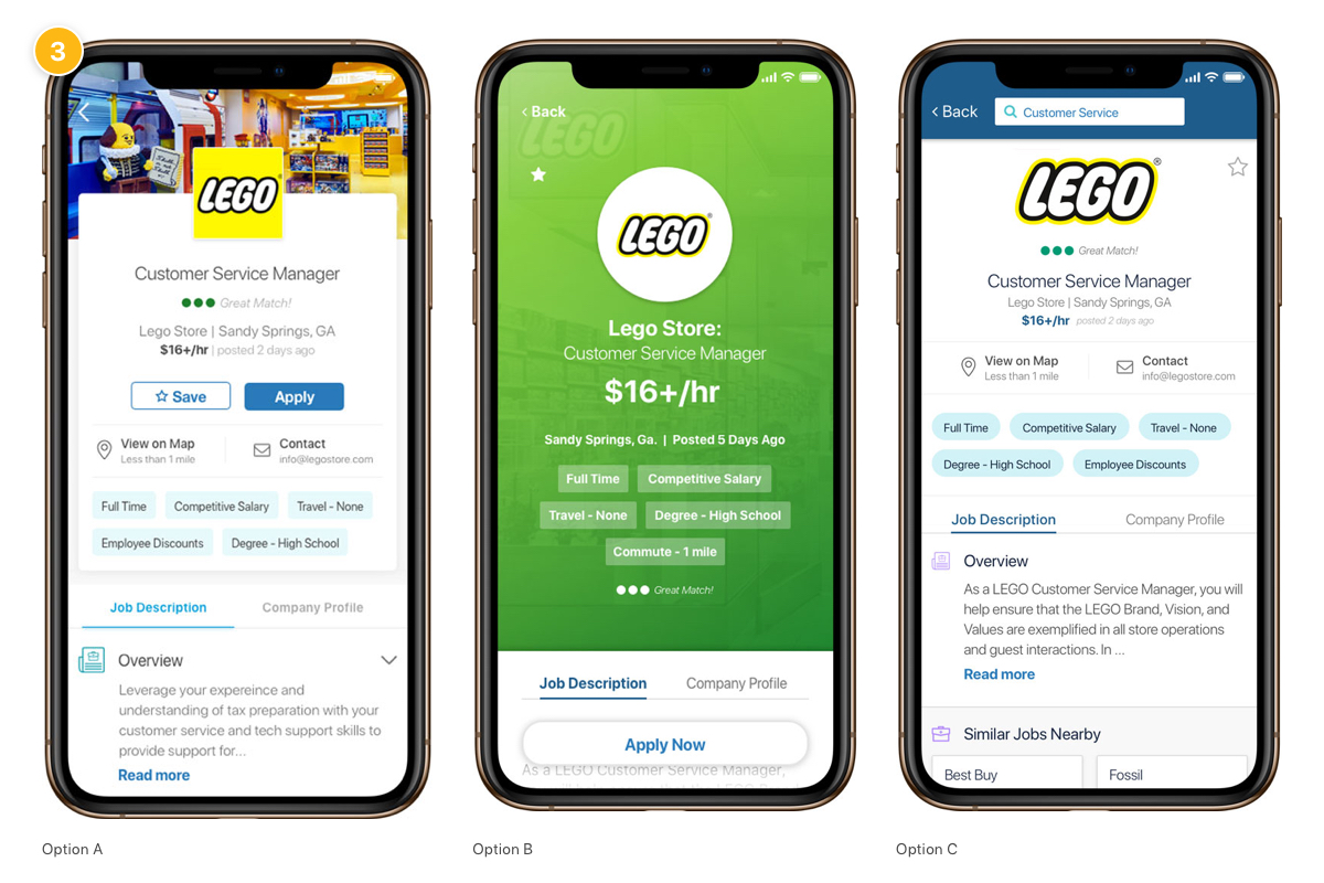
Version 1 – Notifications (Dashboard) | Version 2 – List View | Version 3 – Jobs Detail Content
QualitativE Questions
Are these jobs a good match for you? How do you know? What indicates this to you?
Would you prefer more color or white space on this page? Explain your answer.
Tell us your thoughts on the amount of information displayed when you scroll up and down the page.
Quantitative Questions
On a scale of 1 to 5, how would you rate…
Colors Used On The Screen?
Ease of Discovering Information?
The Legibility of the Text?
Overall Layout of the Screen is Easy to Use?
Demographic Information

Testing Conclusion
Design A was the preferred design for all three sections. Design A had the perfect combination of use of colors, spacing and included details that people felt were important.
These findings help to direct future design decisions across our mobile apps. These mobile designs have then influenced the whole design ecosystem including our web and desktop tools.

Information Architecture
Further Exploration – App Site Map
The team’s focus was the merging of the legacy jobseeker app and the mobile revolution Initiative that included the feature enhancements. We needed to start with the information architecture.
Our primary goal is to create a flexible, foundational information architecture that can evolve through expanding or contacting without major rework (Ux & Engineering). Most importantly a foundation that evolves without significantly hurting the user experience.
Open Card Sort
Based on the results, the following emerged as the strongest categories, both conceptually and in terms of how many respondents created them in their ideal organizational scheme.
Jobs
Resume / Documents
Profile
Account / Settings
Notifications / Alerts
Career Development and Learning
Company Information
Final Results
Based on the results from the open card sort, plus a follow up tree-jack test, we felt confident in this new taxonomy and navigation structure.
Results Metrics
The Good News


Total and New Users
A strong consistent uptick in the amount of total and new users. The new functionality and improvements were released over multiple releases in q2 and q3.
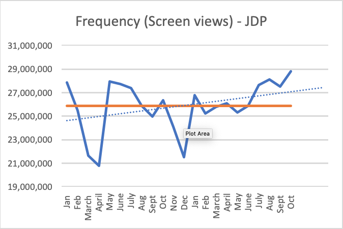

Job Details Views and Duration
A positive trajectory of job views. Users have viewed more job details and have spent more time on job description details.
The Bad News


Applies and Apply Frequency
Applies on the other hand have taken sharp dip. This decrease in EOI needs more exploration into why users are applying less. Are they applying to more quality jobs over the amount of jobs, or is there an underlying problem that hasn’t been discovered yet?
Jobseeker Icons
Conclusion
Building or updating a product takes time, many teams, and skilled collaborators to ensure success. If I could change anything I would have focused more of the ux team’s time toward the initial discovery phase. Understanding what the product is doing right and uncovering existing pain-points would have helped to further strengthen the tool. Having a better understanding of the user’s needs and tying those needs to the business goals would have helped when prioritizing the product roadmap.
Overall, this was a great learning experience and the process led to a successful product release.