
Ibotta Performance Network
Pando 2.0 Design System
In the fall of 2024, I stepped in to reset Pando, a design system effort that had stalled and fallen out of sync with how teams were building. As priorities shifted, teams shipped in parallel without a shared front-end foundation, driving inconsistency, rework, and system drift.
I realigned the system around a Material UI foundation with our engineering partners, creating a shared front-end language that reduced friction and improved collaboration. Guided by an 80/20 approach, we leaned on proven patterns for most UI needs and focused our effort on differentiated, product-specific work—strengthening consistency while helping teams move faster without sacrificing quality.
Visual Overview


The Task
Platform Consistency in a Velocity-First Organization
The organization optimized for speed and team autonomy, but the tradeoffs were mounting: fragmented UI, rising cognitive load, repeated reinvention, and growing frontend debt. Partial design system adoption made this worse, introducing overrides, slowing delivery, and eroding trust.
The challenge was enabling platform consistency without mandates in an environment where teams shipped in parallel, Material UI was applied inconsistently, Pando’s limited theming forced workarounds, and design system work competed with revenue-driven priorities—making adoption something that had to be earned, not enforced.
Problem Statement
“How do we help the organization recognize that inconsistencies in its product experience (“shipping its seams”) create user confusion and navigation friction—and guide them toward platform experiences that enhance development efficiency, consistency, and maintainability.”
The Goal
The goal was to make platform consistency the default, not an extra step. By reducing friction in Pando/MUI adoption and aligning UX, Product, and Engineering around shared ownership, teams could move faster without fragmenting the experience.
The hypothesis was simple: if consistency is built into a production-ready framework with clear templates and extensible components, teams will adopt it naturally—reducing custom work, rework, and long-term debt.
Strategy: Treat Consistency as a Product
1. Meet Teams Where They Are
Rather than enforcing compliance, the strategy was to make adoption the obvious choice. Pando 1.0 provided only basic theming, pushing teams—many stronger in backend than front-end systems—to rely on overrides and custom code for common layout needs. Without shared grid and layout primitives, design–code drift increased, making the system harder to use than bespoke solutions. To succeed, Pando had to be simpler and more useful than custom code.
2. Layered Migration Model (System Architecture)
Pando 2.0 adopted a layered system model that aligned both design and engineering around a shared language, enabling incremental adoption without blocking delivery:
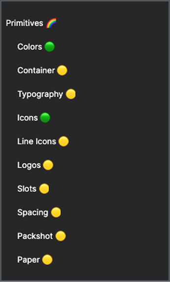
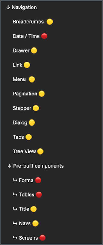
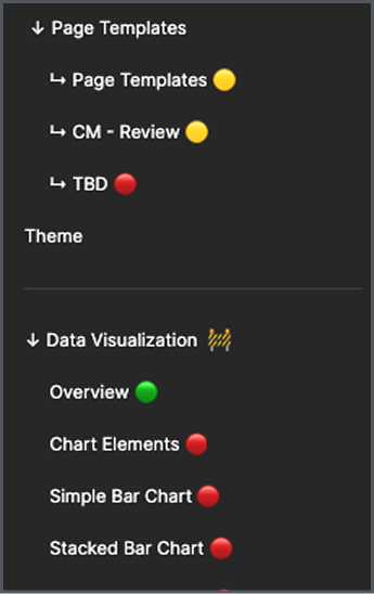
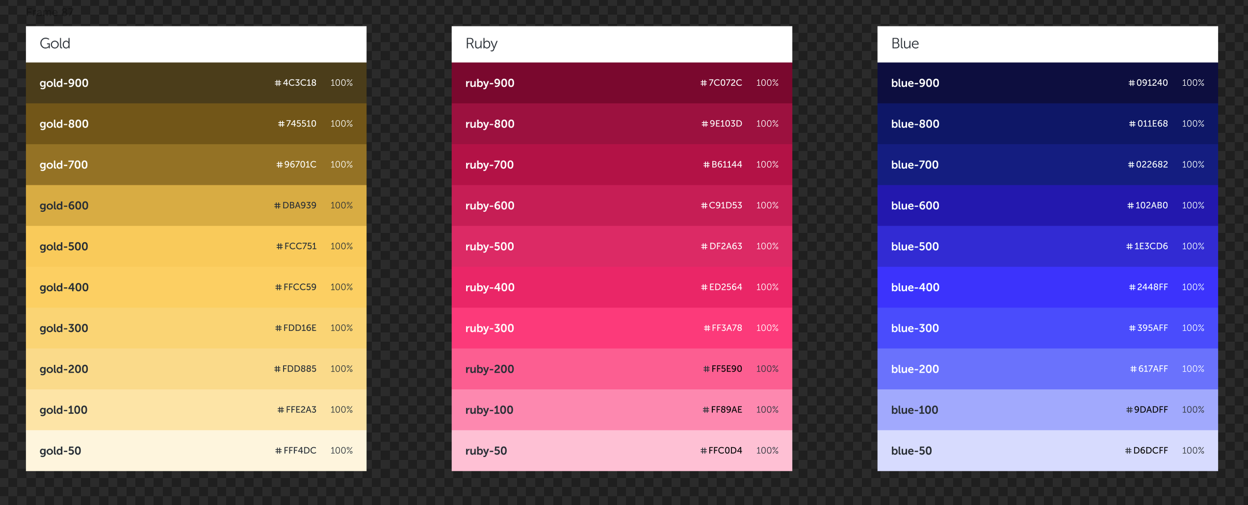
A. Primitives — tokens, spacing, typography, etc.
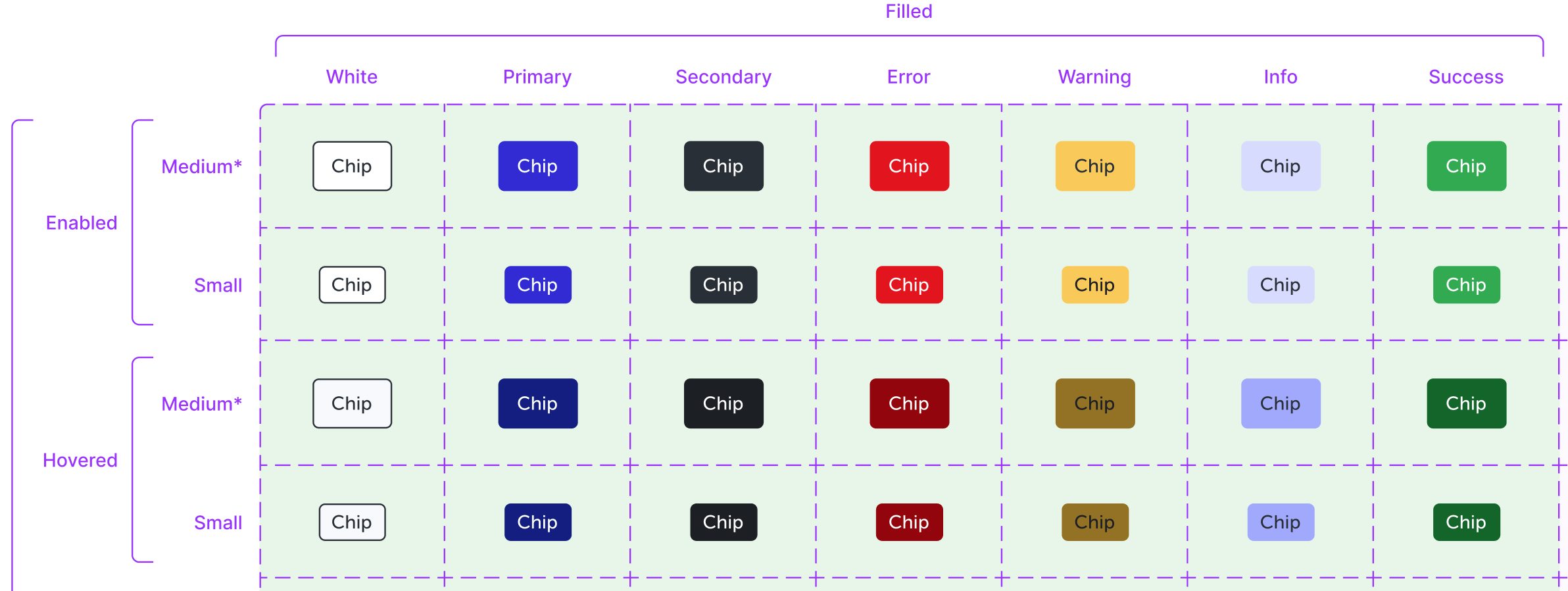
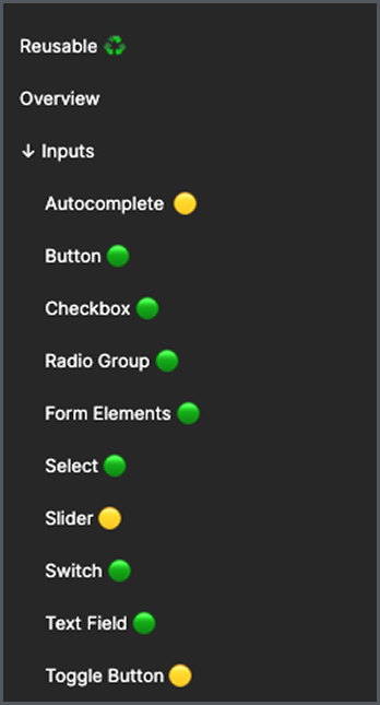
B. Components — MUI-aligned atoms & molecules
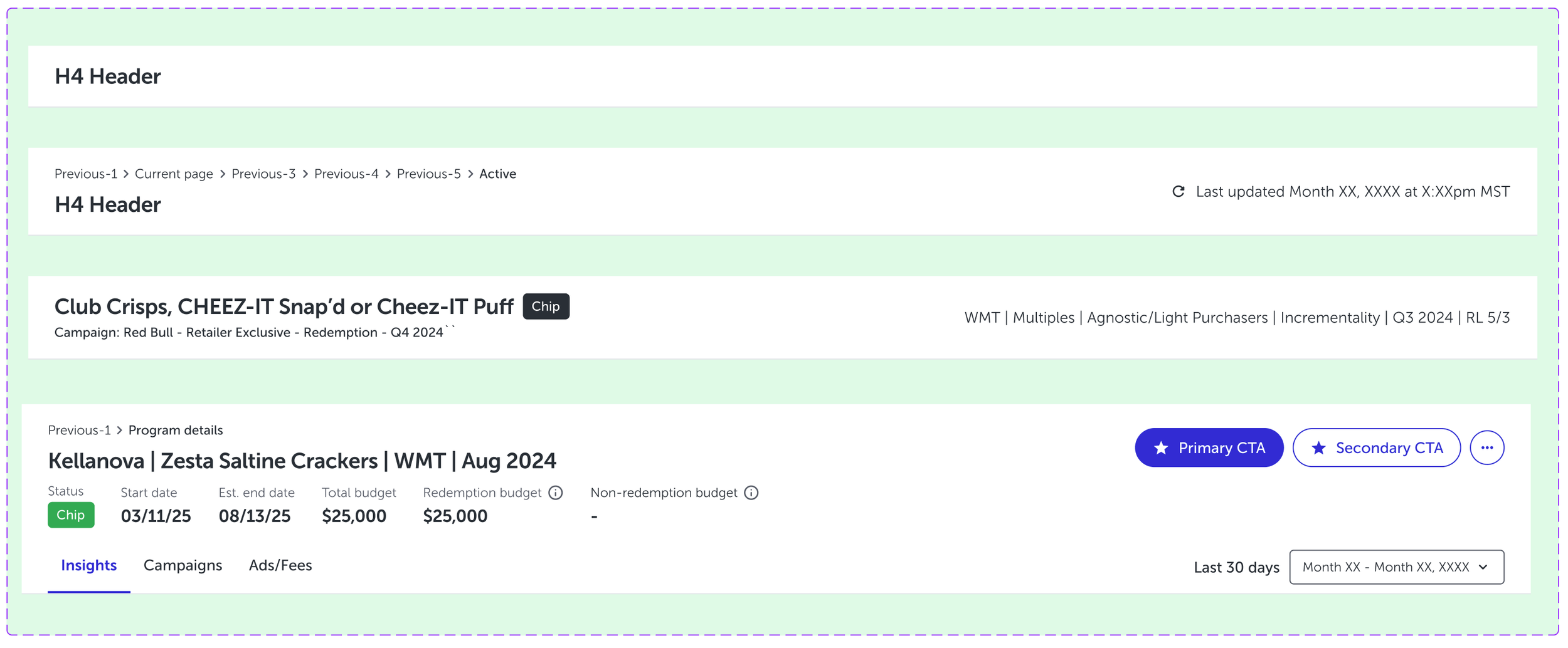
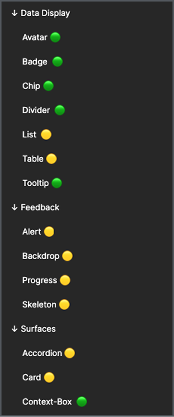
C. Organisms — tables, headers, dialogs, etc.
D. Templates — layout scaffolds
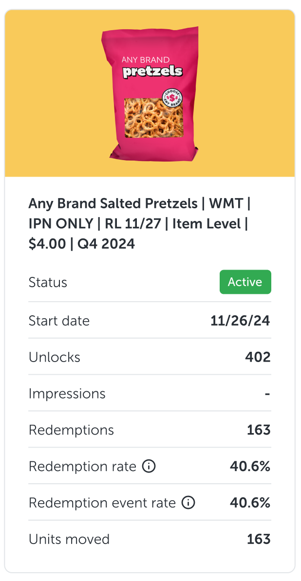
E. Pages — product implementations

Beyond architecture, this work closed an internal gap by aligning the design team on shared terminology with engineering. Moving away from outdated atomic language reduced confusion, sped up decision-making, and strengthened how we evaluated new system directions.
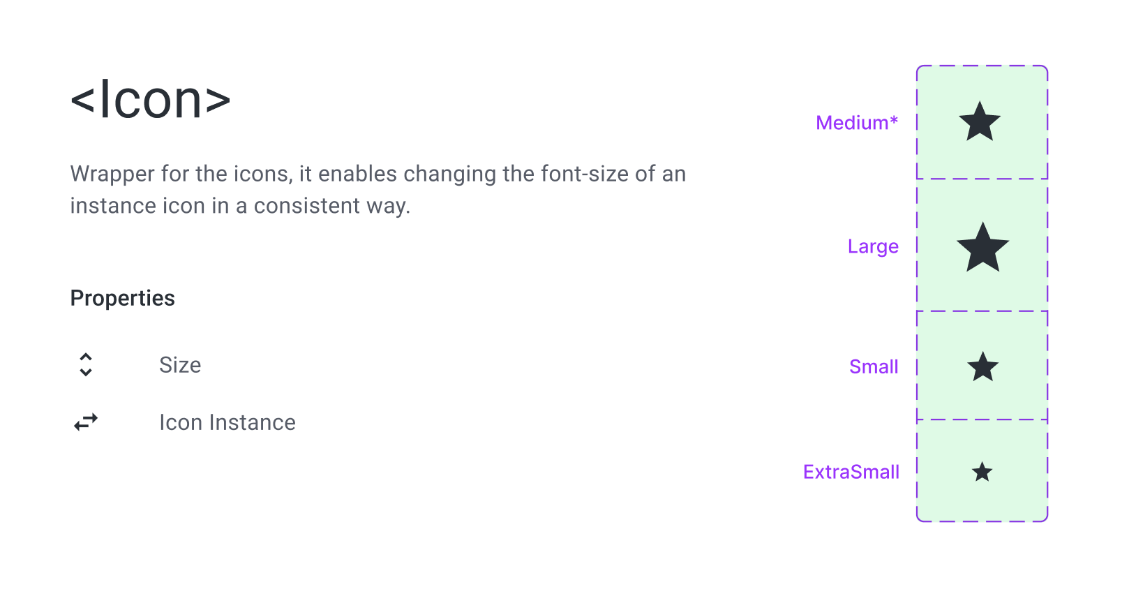
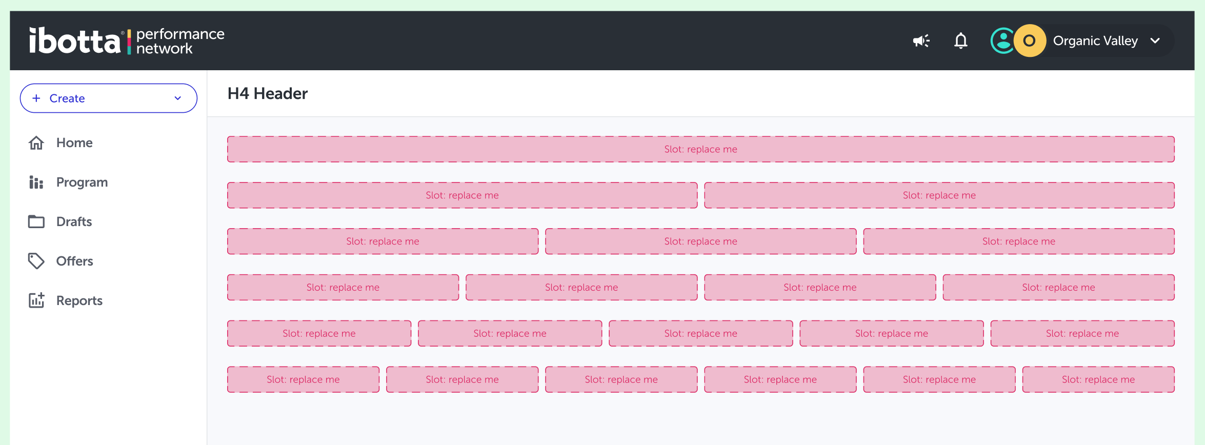
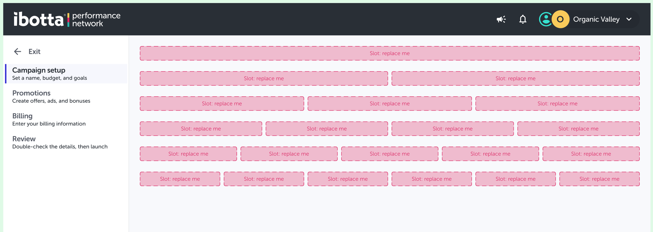
C. Slots-Based Component Architecture
To reduce detaches and overrides, Pando 2.0 adopted a slots-based component approach that clearly defined where and how components could be extended. This improved design–code parity, simplified maintenance, and reduced the emergence of “Frankenstein” components—making the system easier to scale and safer to customize.
The 80/20 Rule: Let the System Do the Boring Work
Strong design systems handle the repeatable work so teams can focus on what differentiates the product. In practice, most of a screen should come from the system and take minimal effort to implement—delivering speed and consistency without wasting creativity on solved problems.
The remaining work is where teams should slow down and invest deeply, designing the moments that matter most to users. When the system carries the baseline, creativity isn’t constrained—it’s focused.

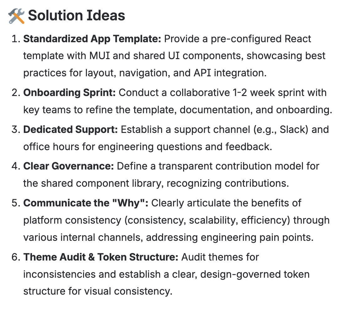
Adoption & Enablement
The hardest part of this work wasn’t building the system—it was earning adoption. Design systems only scale when ownership is shared and friction is low. By partnering closely with Design, Product, and Engineering, we focused on enablement over enforcement through lightweight onboarding, practical guidance, and clear visibility into progress. Framing the system as a force multiplier—not overhead—shifted engagement and reinforced shared ownership.
To reduce friction for new teams, we proposed a standardized portal framework with shared navigation, APIs, and integrations. Adoption lagged due to onboarding gaps, so the solution was a ready-to-use React app template with Pando components, a fully structured example page, and automated testing (Playwright) built in—making the default path the easiest one.
We scoped a focused 1–2 week cross-functional sprint to establish shared context and accelerate adoption. Without sustained ownership and prioritization, however, system work risked stalling as it competed with short-term delivery.

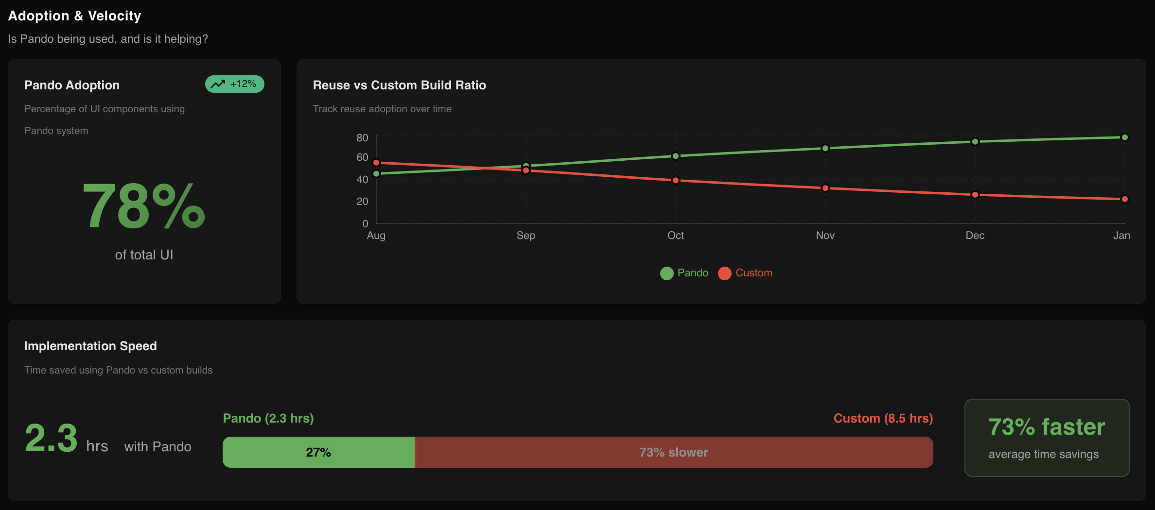
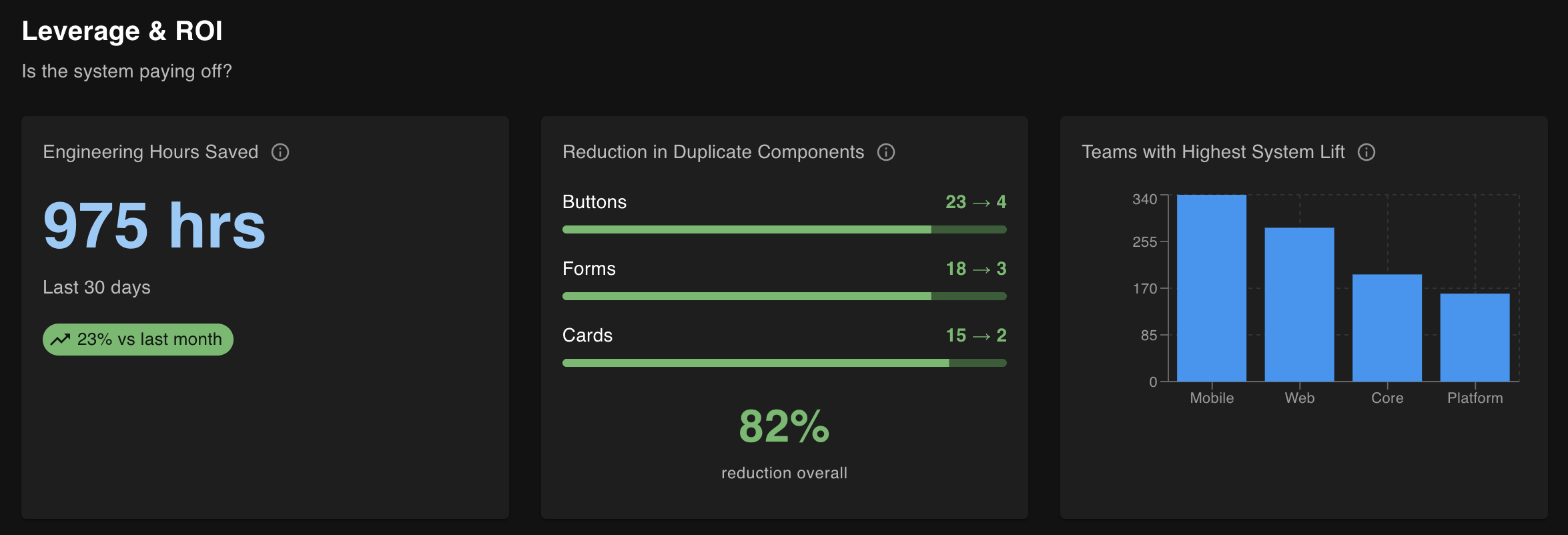
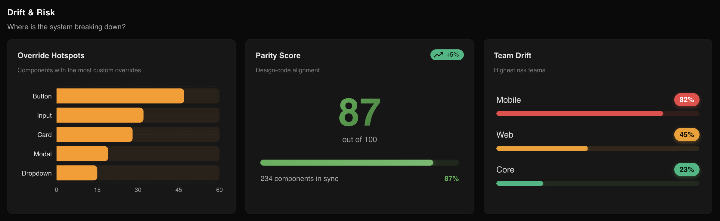
Metrics & Outcomes
Progress was tracked through adoption and platform impact. Early signals included higher Pando reuse over custom builds, faster ticket burn-down, fewer overrides, and improved UMUX Lite scores, with a 63% baseline set in spring 2025.
Over time, these gains will lead to faster front-end delivery, fewer bugs, reduced design and technical debt, and a more consistent cross-portal experience.
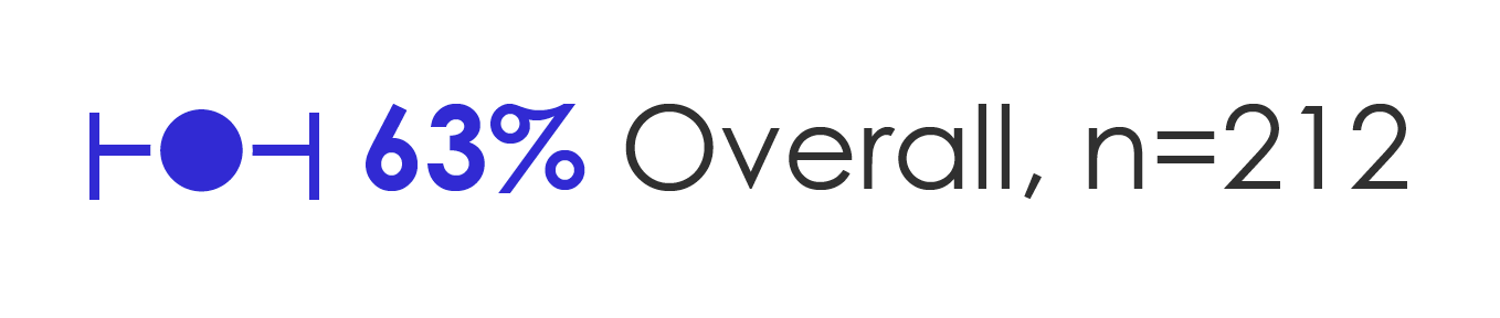
Good: 52 - 71 (0 – 100)
Reflection & Takeaways
This work reinforced that design systems are organizational systems, not UI libraries, and that adoption beats enforcement. When abstraction is done well, velocity and quality reinforce each other, and sustained consistency comes from shared ownership—not heroic effort.
Next, I’d extend this work by prototyping an AI-powered system health layer to track adoption, drift, accessibility, and reuse across design and code, turning platform consistency into an ongoing signal.
Pando 2.0: From Design System to Living Platform
AI-Powered System Health Layer
Use AI to turn Pando from a static library into a living platform—one that continuously measures adoption, detects drift, and guides teams toward consistency without enforcement.
Phase 1 — Foundation & Visibility
This phase established baseline visibility into real Pando usage without disrupting team workflows. Design–code parity checks across the Figma API, Tokens Studio, Storybook, GitHub insights, and LLMs surfaced drift, overrides, and reuse versus custom builds—creating a shared source of truth through adoption rates, top overridden components, and a parity score.
Phase 2 — Insight & Enablement
With visibility in place, the focus shifted to enablement. LLMs highlighted adoption trends and reinvention hotspots, while in-context guidance via Figma plugins and VS Code AI supported Pando/MUI usage during design and build. Accessibility monitoring with Playwright, axe-core, and an AI review layer surfaced early quality risks, tracked through reuse trends, accessibility scores, and time-to-implement comparisons.
Phase 3 — Guardrails & Optimization
At scale, AI makes consistency self-reinforcing. Predictive drift detection flags at-risk components, while a system health score rolls adoption, accessibility, and drift into a single signal. Automated recommendations guide where abstractions should evolve—turning platform consistency into a measurable, managed capability.
Outcome
Faster teams, fewer overrides, consistent UX—without mandates.