

Ibotta Performance Network (ipn)
Scaling Enterprise Information Architecture
The task
The platform was originally designed for expert promotion marketers, but as usage expanded to broader digital and social marketing audiences, the existing information architecture began to show strain. Discoverability issues, inconsistent terminology, and unclear task pathways increased friction for self-service users while slowing internal decision-making around structure and naming.
The challenge was evolving the IA to scale beyond expert users without fragmenting the experience—balancing legacy concepts, mixed user mental models, and organizational complexity in a platform that needed to support both velocity and long-term growth.
Problem Statement
How do we evolve an information architecture built for experts into a scalable, intuitive system that supports diverse user needs—without increasing cognitive load, introducing structural debt, or stalling cross-functional alignment?
Visual Overview
information architecture audit
The Before
Annotated navigation screens and the external sitemap showed clear gaps between what users were trying to do and how the platform was structured. Navigation mixed actions with destinations, labels like “Programs” were unclear, similar concepts appeared in multiple places, and account-related controls were hard to understand. Together, these issues created unnecessary friction and signaled the need for a simpler, more scalable information architecture.

The Goal
The goal was to establish a validated, information architecture that aligned with real user mental models, improved task discoverability, and enabled confident self-service as the platform scaled.
By using research to ground our decisions, we aimed to reduce internal debate, align UX, Product, BizOps, and Engineering, and build an information architecture that could grow with the platform instead of holding it back.
Approach: IA Testing Overview
Phase 1.
Internal card sort pilot (qual-moderated | *AMs, ACs, CPs, COAs)
Approach: Moderated sessions with 5-7 *internal participants
Phase 1 focused on quickly identifying obvious labeling issues and internal bias before involving external users. Internal stakeholders had deep domain knowledge, making them well-suited to pressure-test terminology, surface ambiguous labels, and highlight areas where internal mental models might diverge from how the product was currently structured.
What this de-risked
Shipping confusing or overloaded labels into external testing
Anchoring later research on flawed terminology
Wasting external research cycles on known internal issues
Phase 2.
External card sort (quant-unmoderated | *Marketers)
Approach: 40 external participants (*digital, social, and promotion marketers)
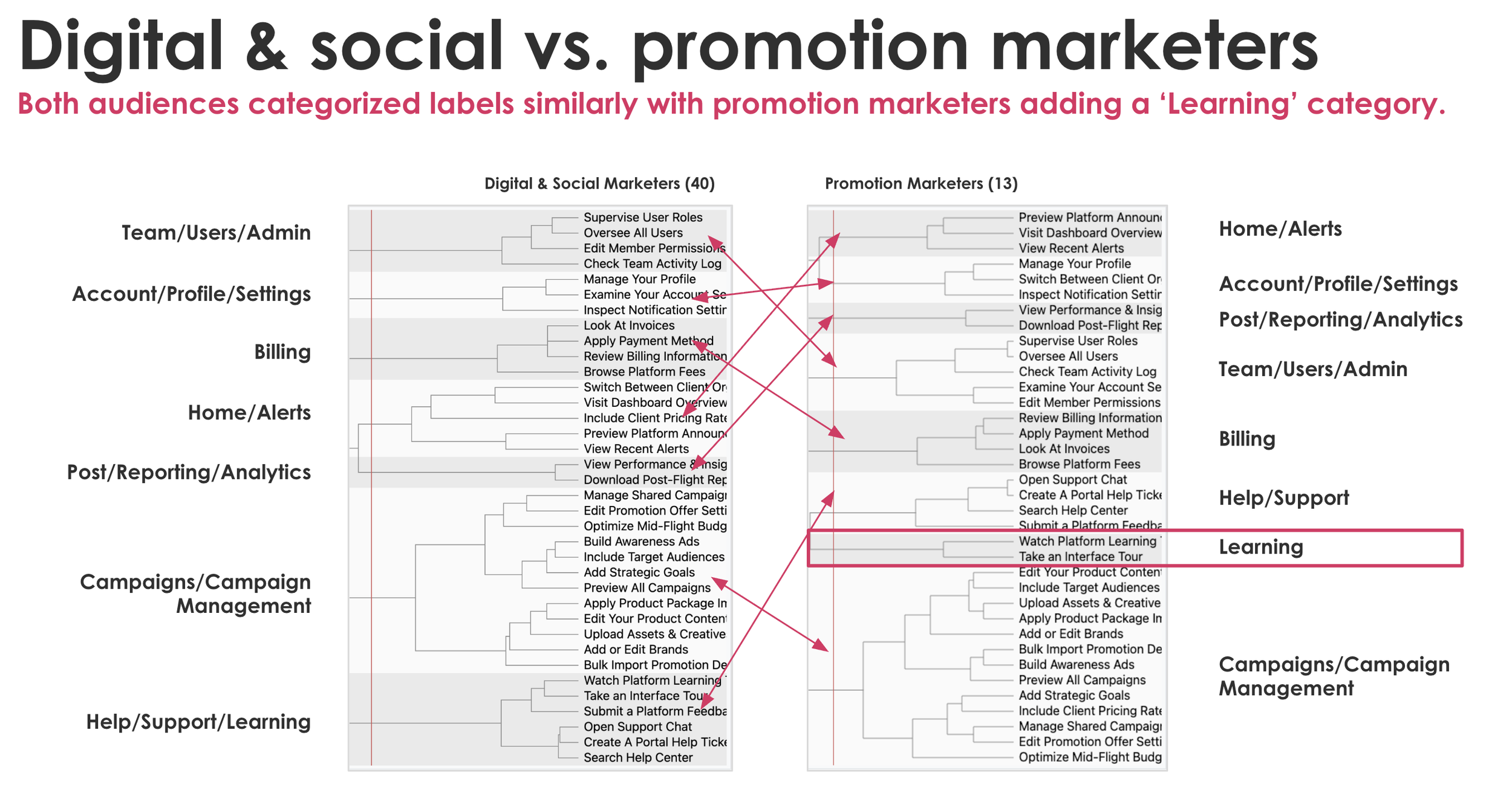
Phase 2 validated whether proposed groupings aligned with how real users conceptualize the product—at scale. An unmoderated quantitative card sort allowed us to detect strong patterns across multiple user segments and compare internal assumptions against external mental models.
What this de-risked
Designing navigation around internal structure instead of user intent
Overfitting the IA to a narrow audience
Making structural decisions without statistical signal
Phase 3.
External, New IA structure prototype testing
(qual-moderated | *SBGs, ATs, BBTs)
Approach: 8-10 external participants who use the IPN (*Small Brand Generalists, Agency Tacticians, Big Brand Tacticians)
Phase 3 tested whether the validated structure actually worked in practice. Task-based first-click and usability testing allowed us to observe real decision-making, identify hesitation points, and validate that users could complete high-value workflows within the proposed IA.
What this de-risked
Implementing a theoretically sound but practically unusable structure
Discovering critical usability issues post-launch
Misinterpreting card sort success as task success
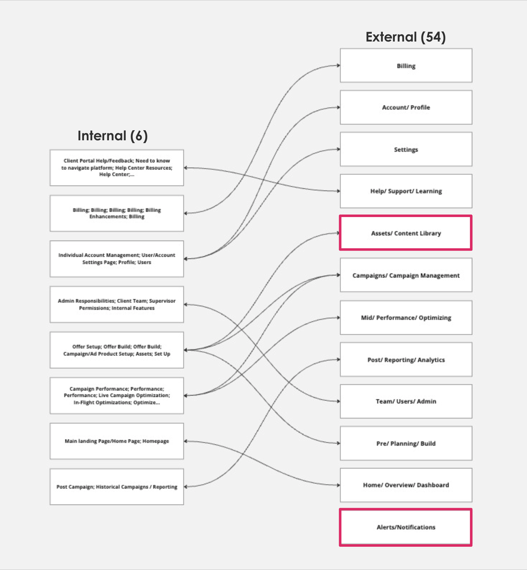
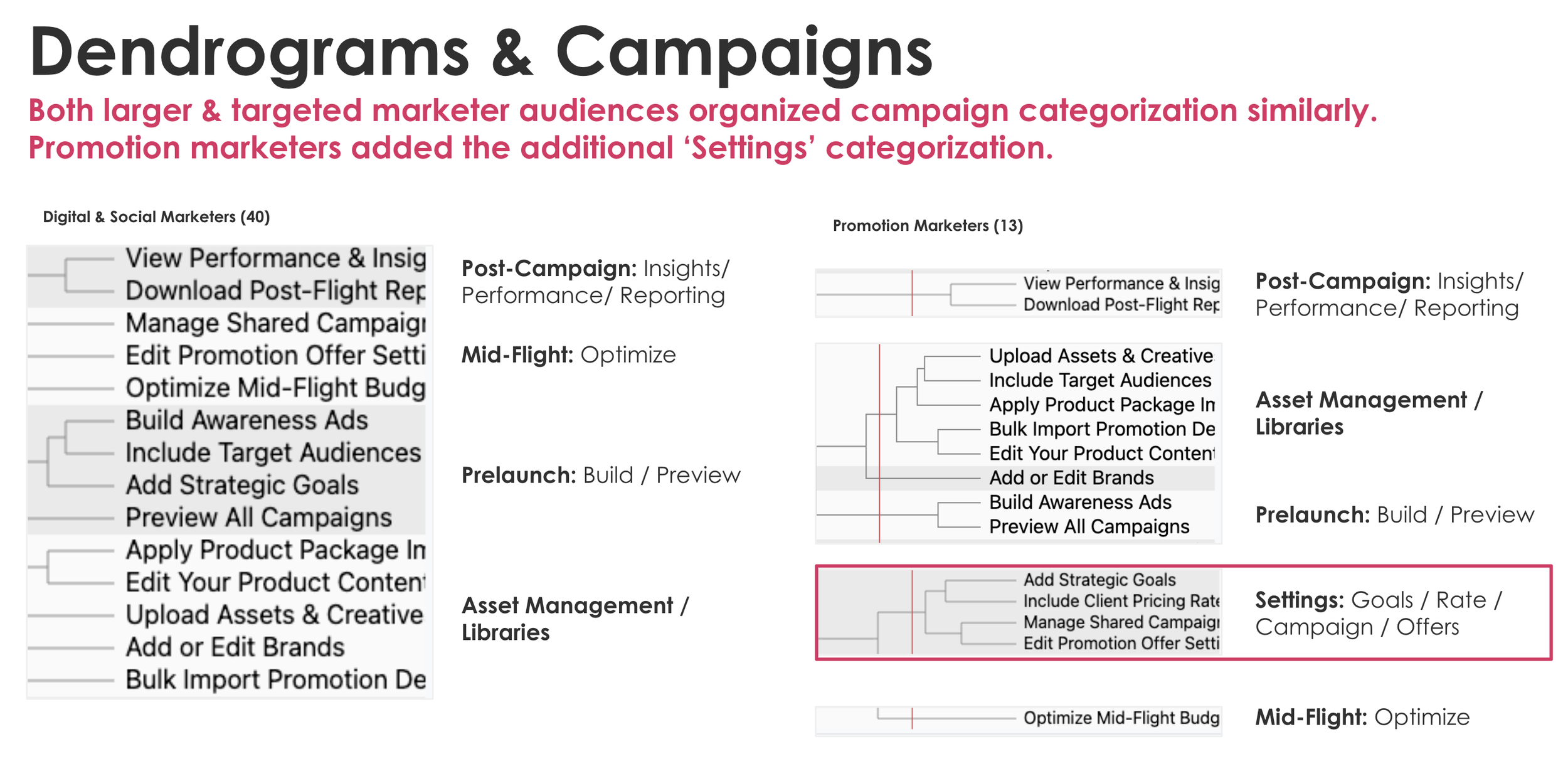
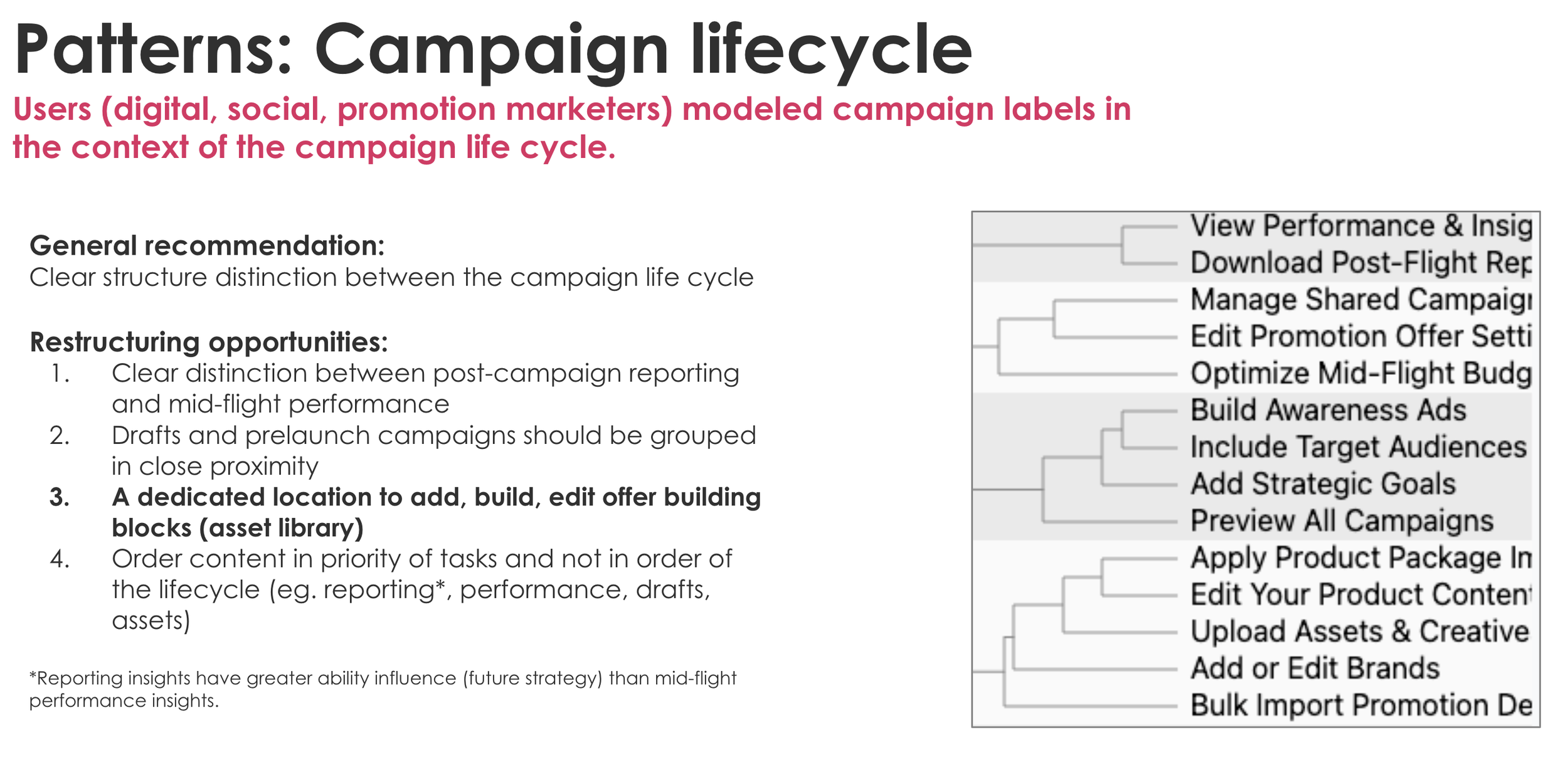
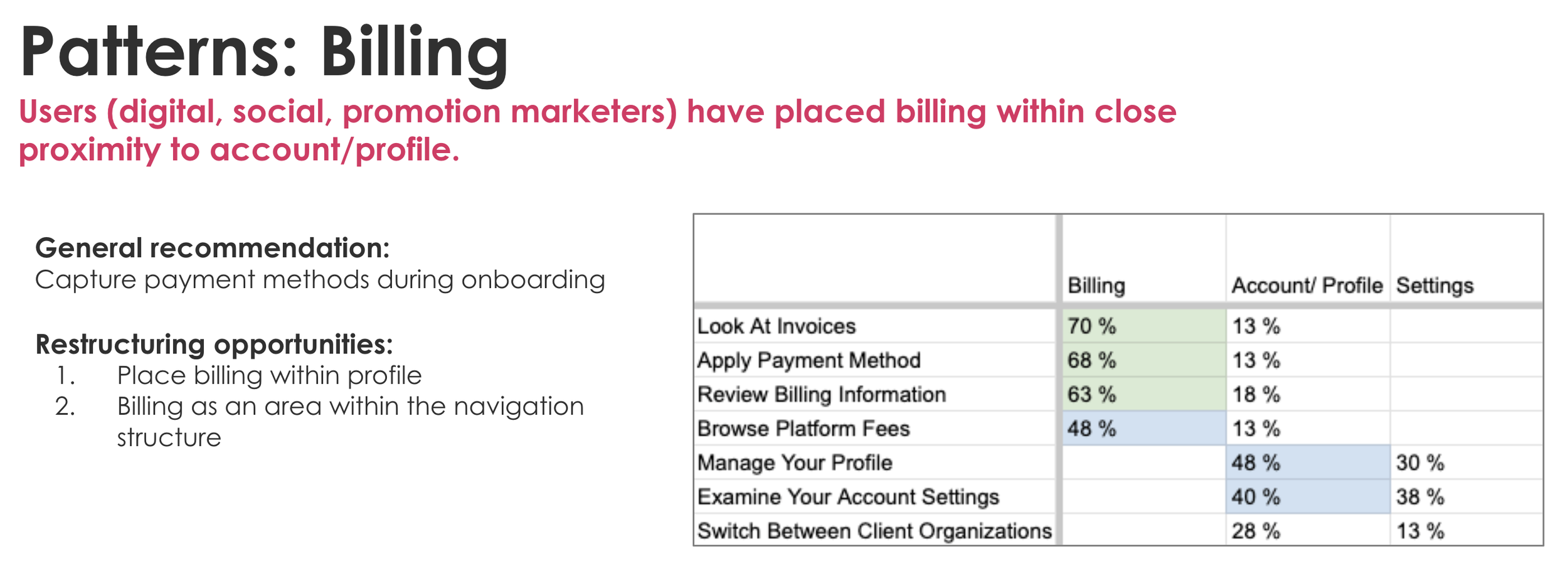
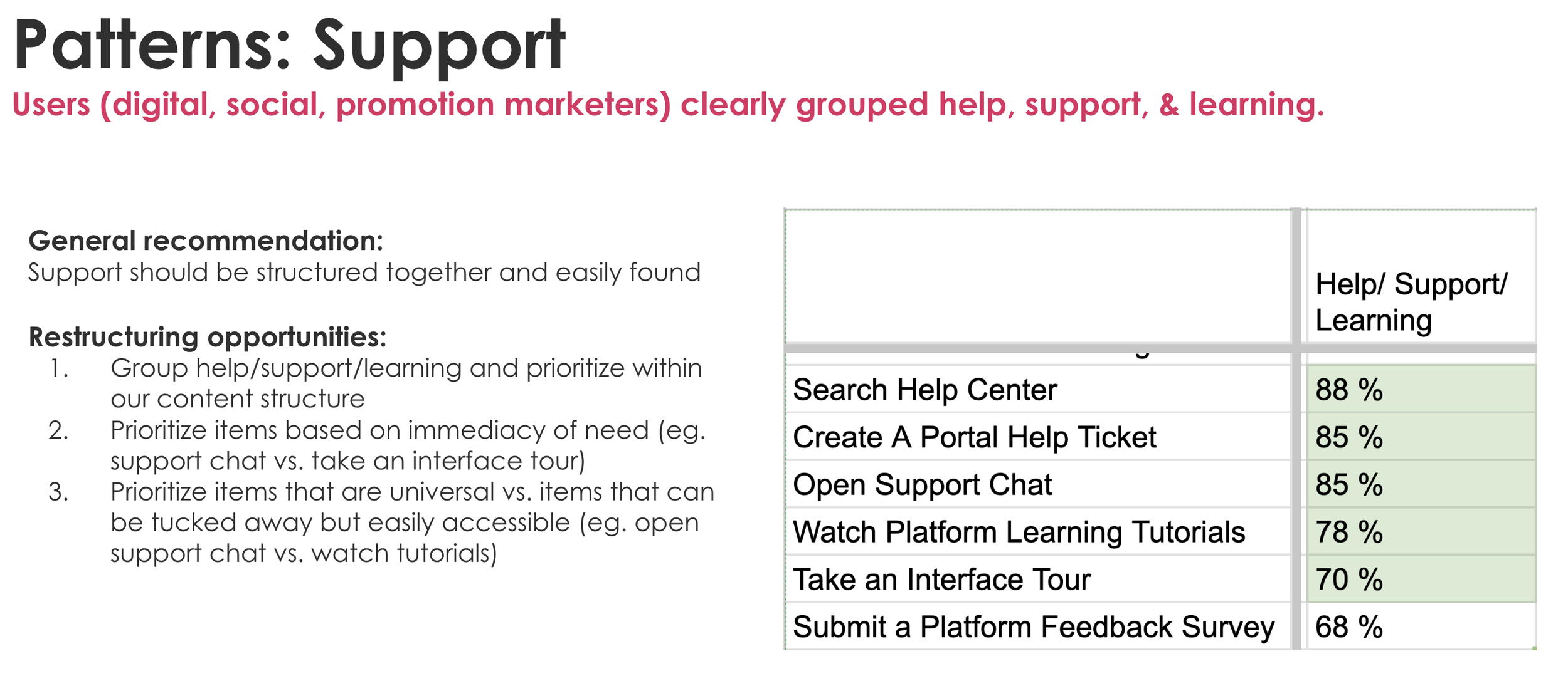
Phase 2 Testing
Key Quantative Insights
Through phased IA testing, we found that users—regardless of role—mentally organize the platform around the campaign lifecycle rather than internal product structures. Pre-launch, mid-flight optimization, and post-campaign reporting were consistently grouped together, while billing and account management were expected to live side-by-side.
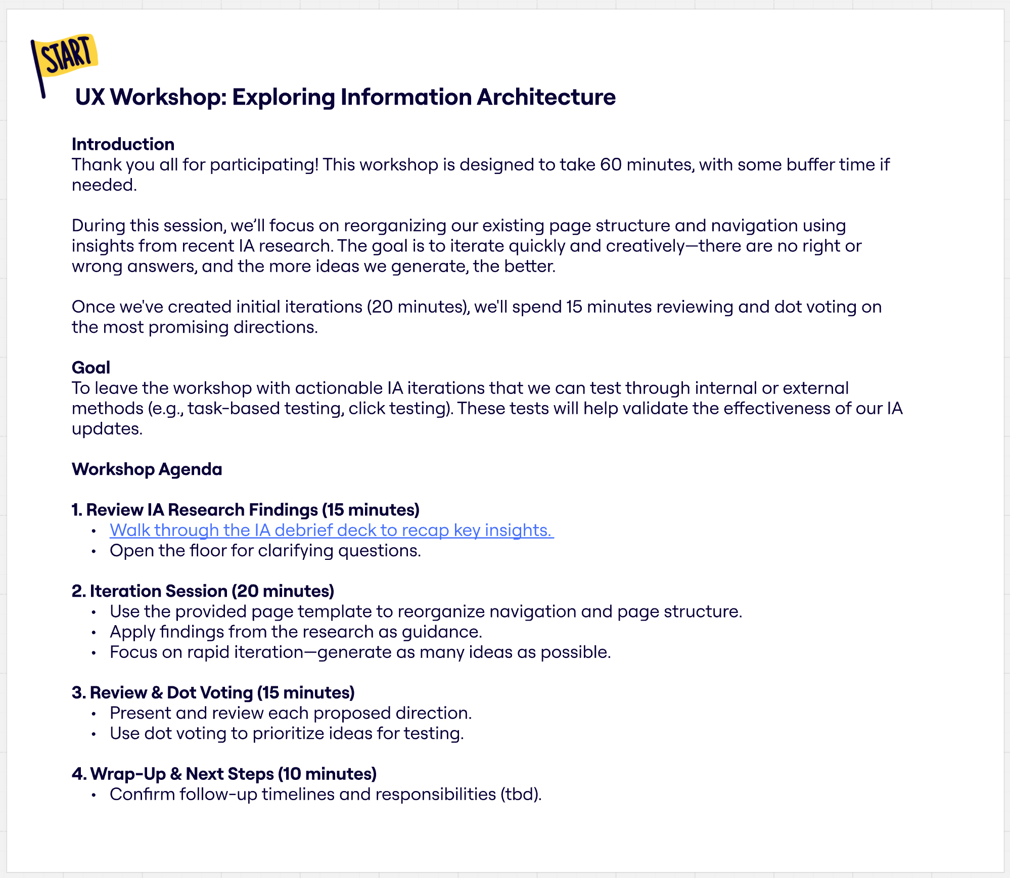
UX Workshop
I led a collaborative UX workshop to explore and iterate on potential IA directions informed by earlier research. The session brought together UX researchers, content designers, and product designers to align on insights and quickly generate structural ideas. To keep the work focused and actionable, I provided a lightweight wireframe template that teams used to reorganize navigation and page structure, enabling rapid exploration and prioritization of concepts for future testing.
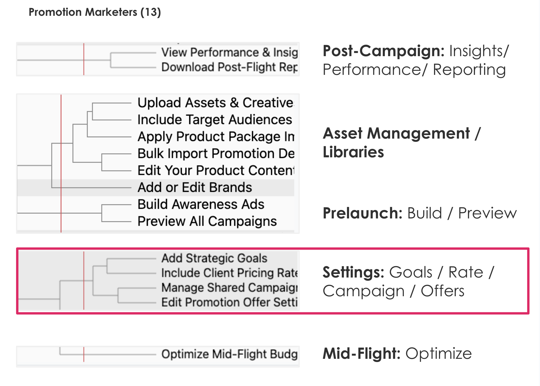
Phase 3 Testing
External Moderated Prototype
Phase 3 Prototype Testing
Key Qualative Insights
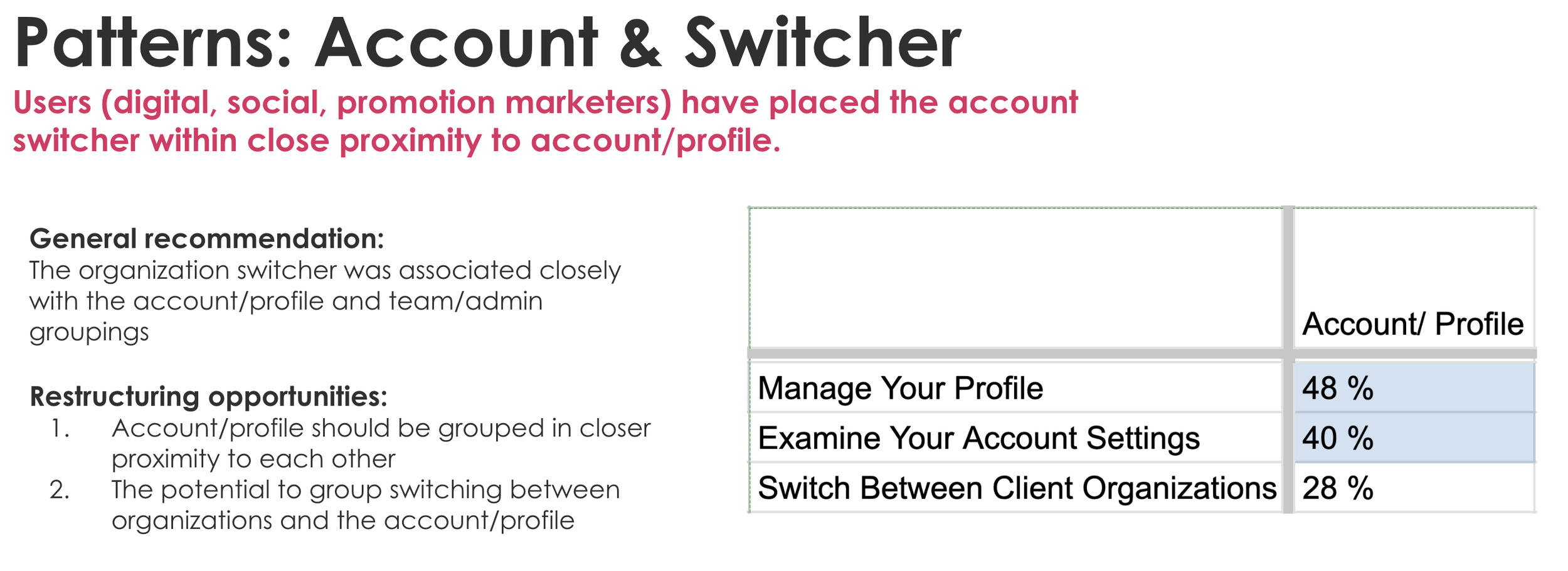
Participants were most successful when navigation labels reflected user intent (e.g., create, manage, review) rather than internal structure, validating the move toward action-oriented groupings. The organization switcher was easily found when paired with profile and account settings, reinforcing that org context is viewed as part of the user’s identity.
Separating Drafts from Active and Completed campaigns reduced confusion around campaign state and prevented incorrect assumptions about what was live. Overall, Phase 3 testing confirmed the IA direction and refined edge cases, shifting the conversation from whether to proceed to how and in what order to implement.
Design Decisions
The key insights directly informed a restructured IA that prioritized task clarity over legacy hierarchy. Campaign actions were consolidated, a dedicated Drafts area was introduced to reduce ambiguity, and billing was aligned with account settings to better match user expectations.
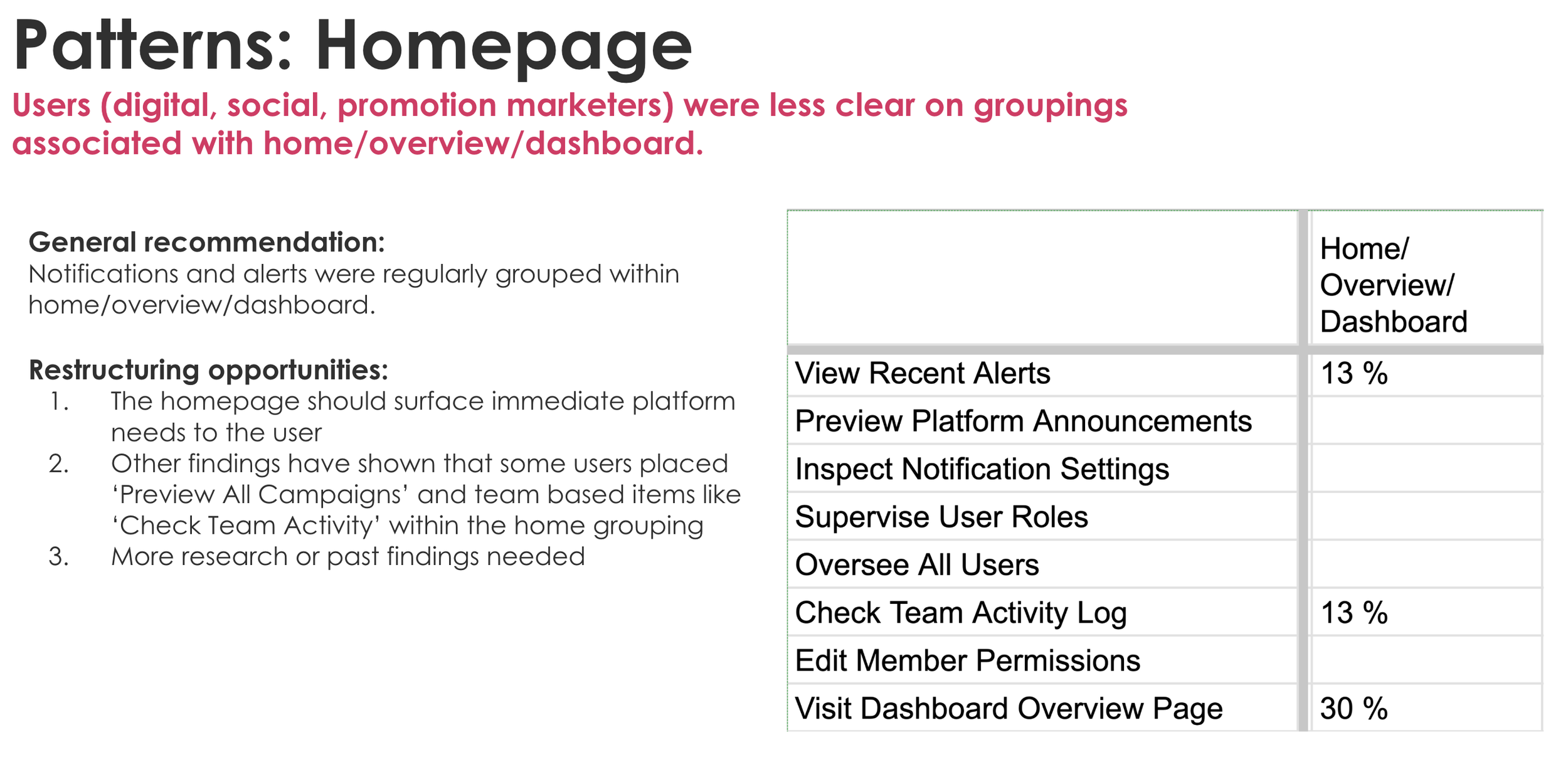
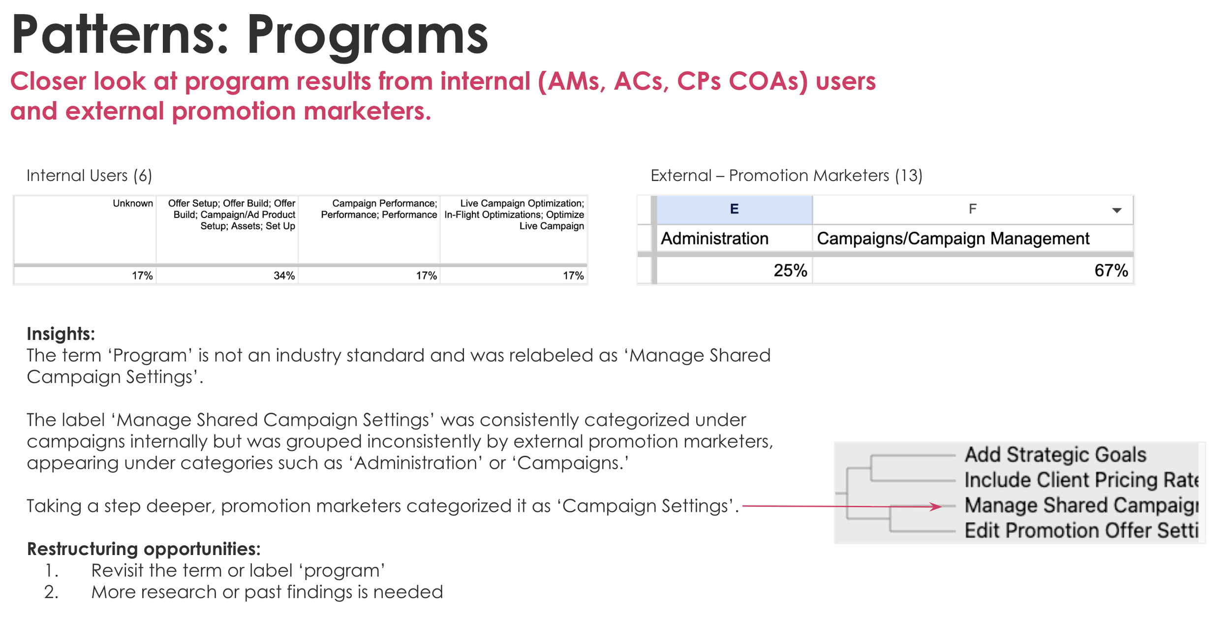
Not all findings led to immediate decisions. Homepage expectations and the role of “Programs” surfaced as areas requiring deeper alignment, so we intentionally deferred those changes and planned follow-up workshops with BizOps and Product.
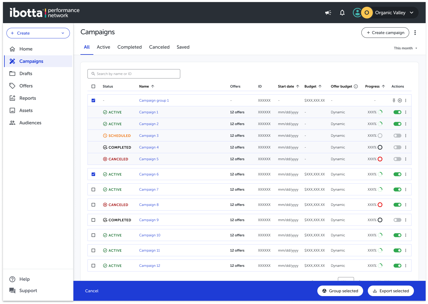
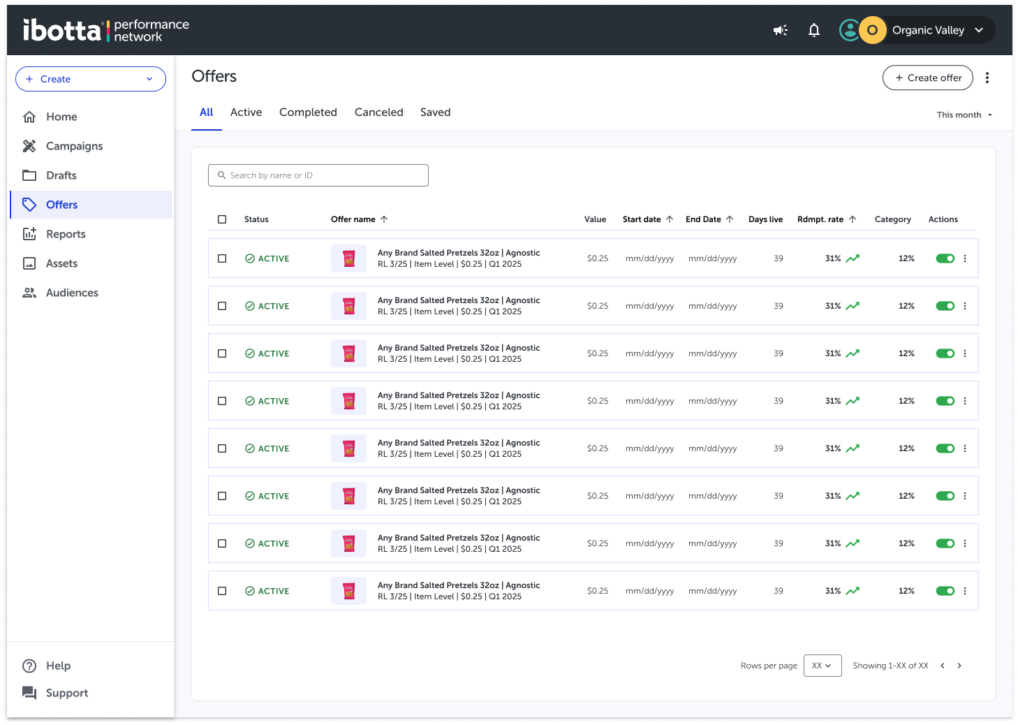
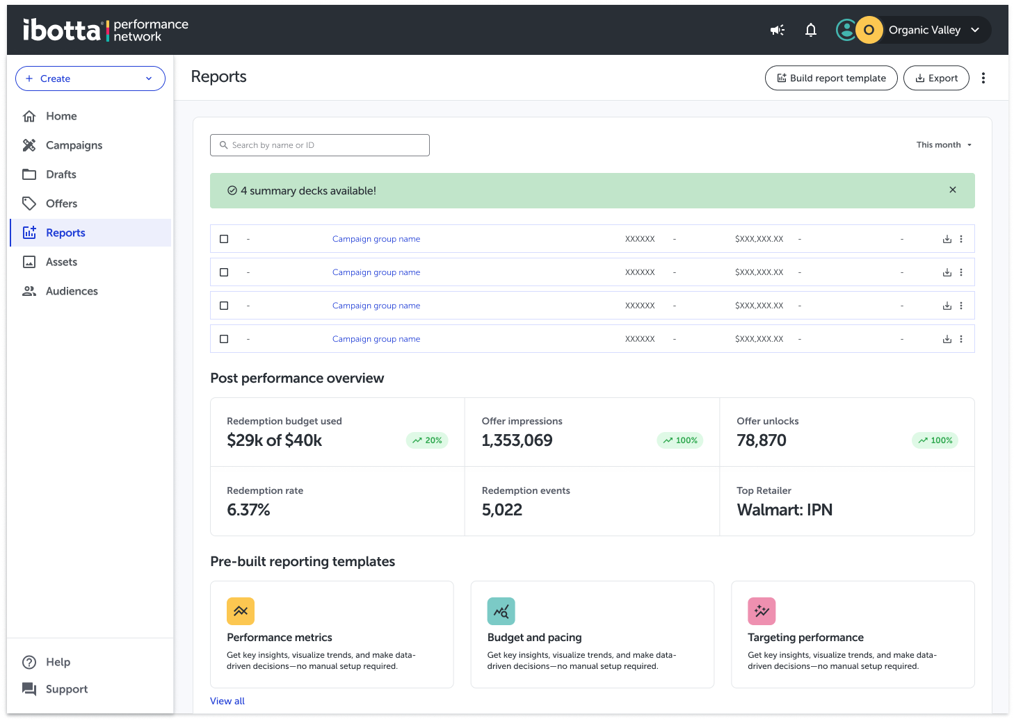
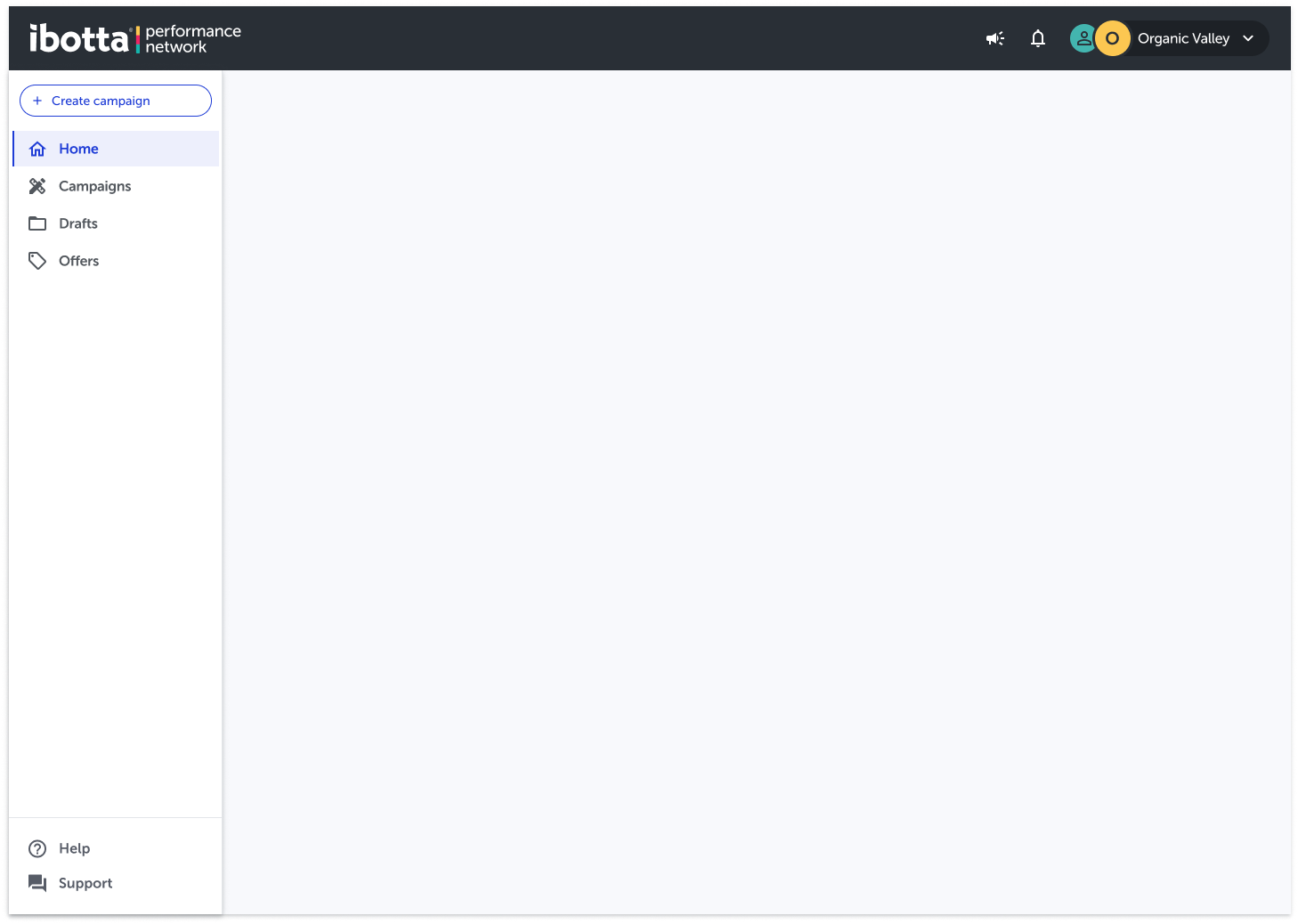
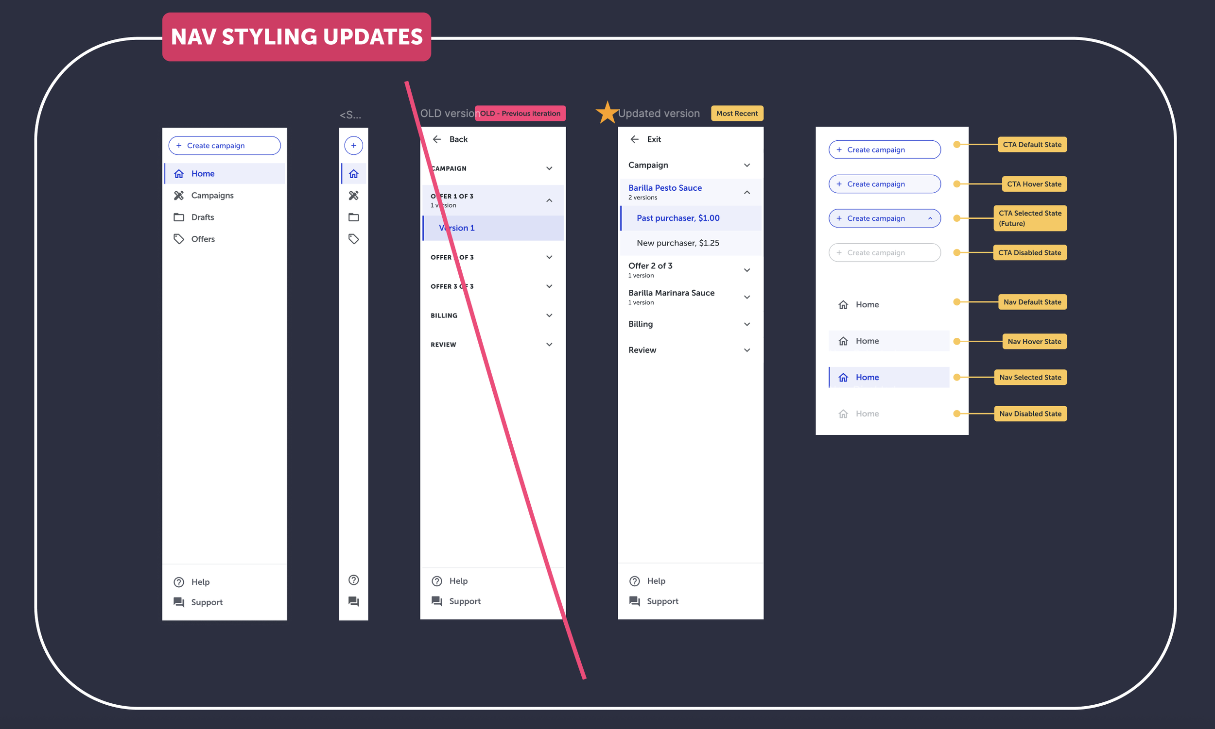
IA restructuring, renaming, and restyling
Restyling update for the Primary CTA and Left Navigation
‘Overview’ renamed to ‘Home’
‘Programs’ renamed to ‘Campaigns’ (In-Progress)
‘Expired’ status renamed to ‘Completed’ status
Move help from global nav to the left nav (bottom)
Updating the support chat treatment
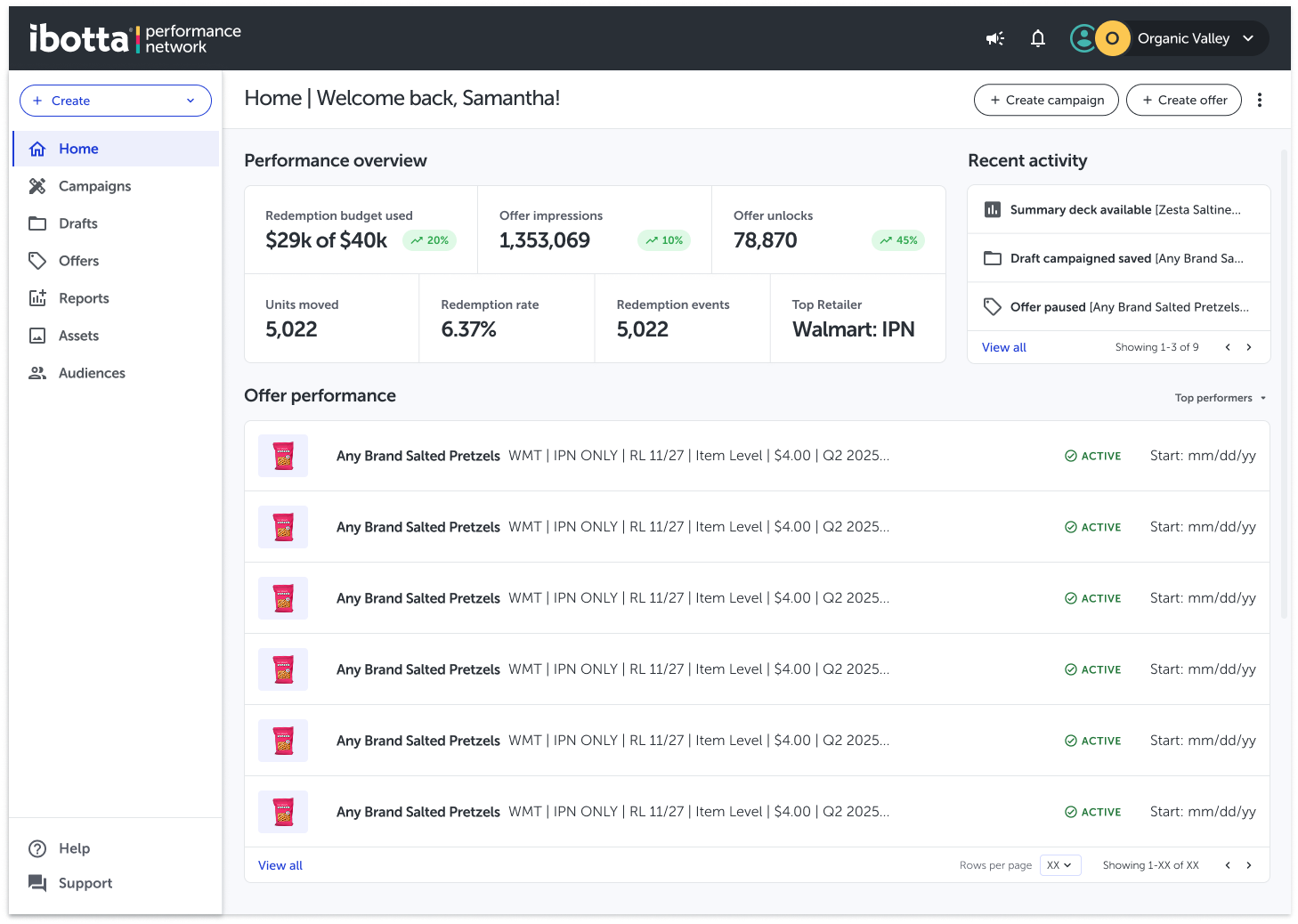
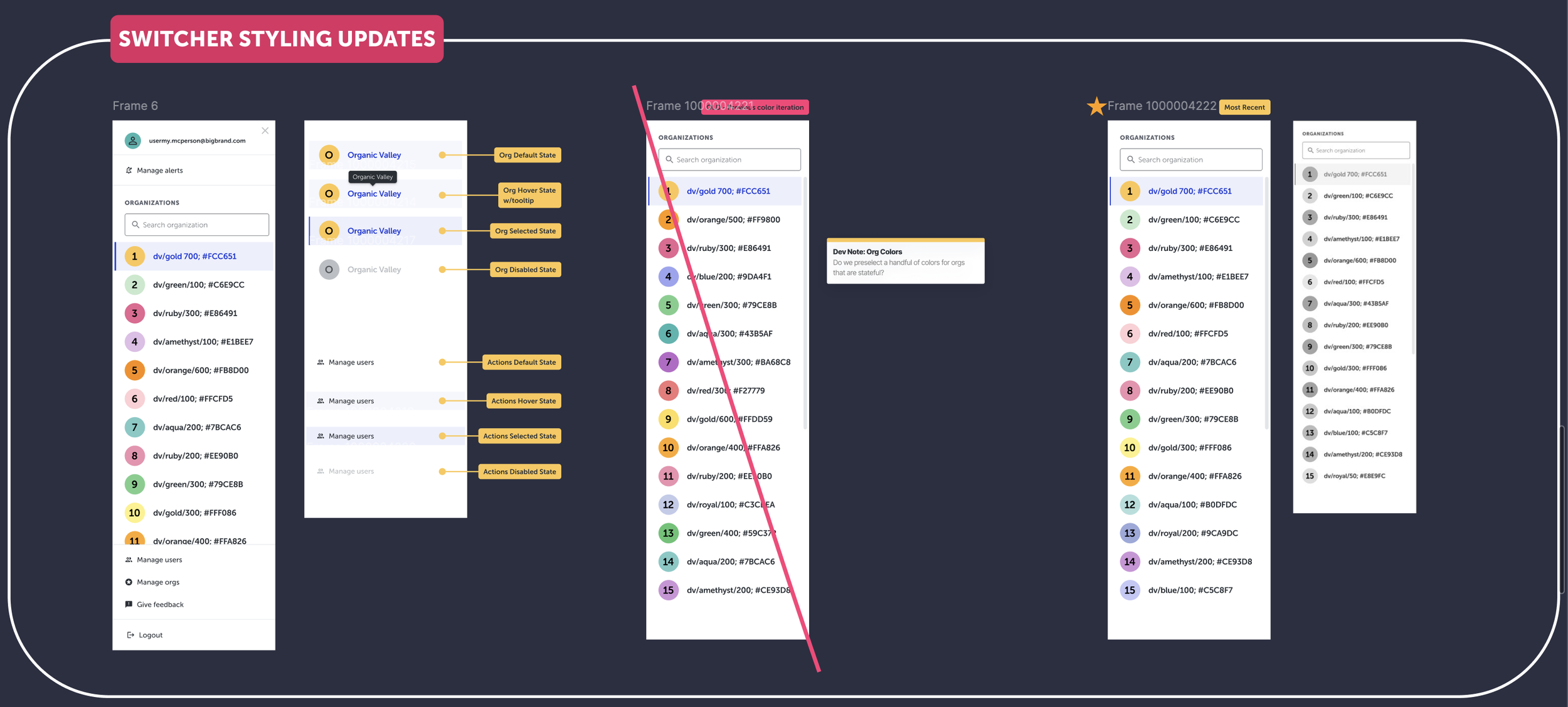
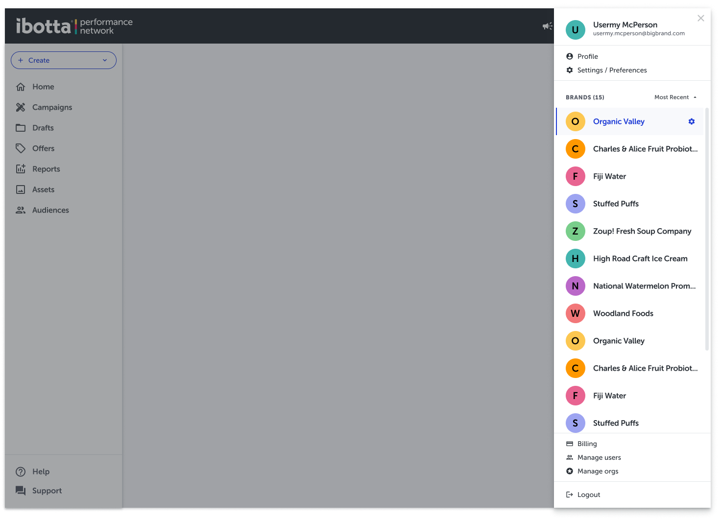
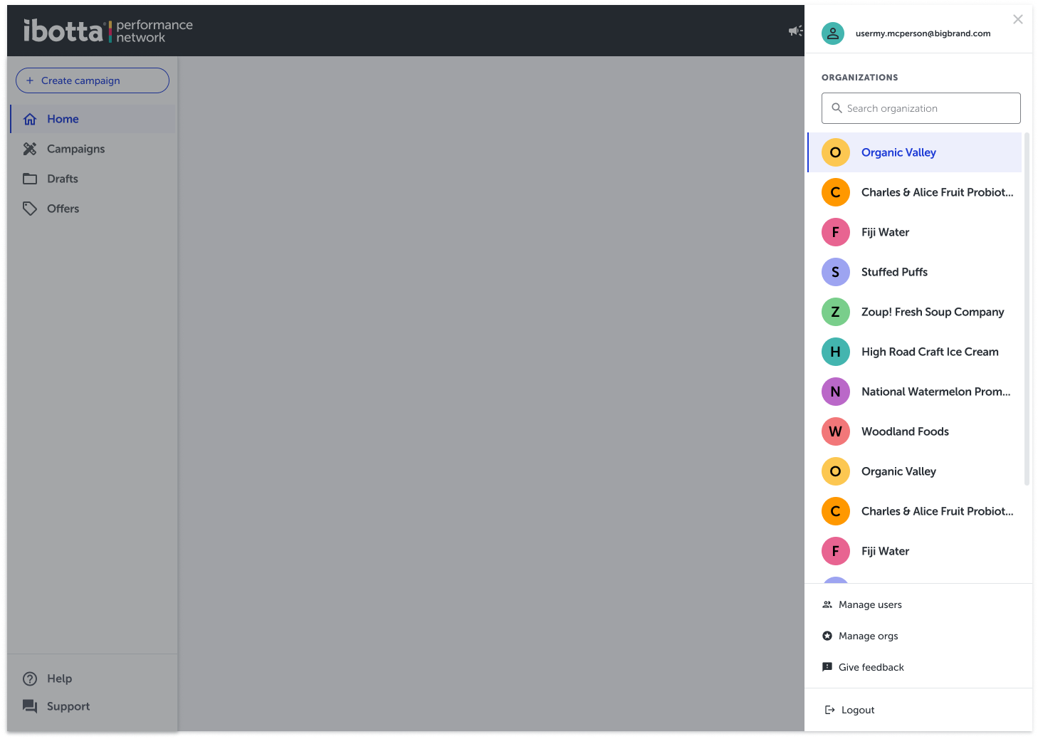
Profile Org Picker
Profile and Org are combined within the top right of the global nav header.
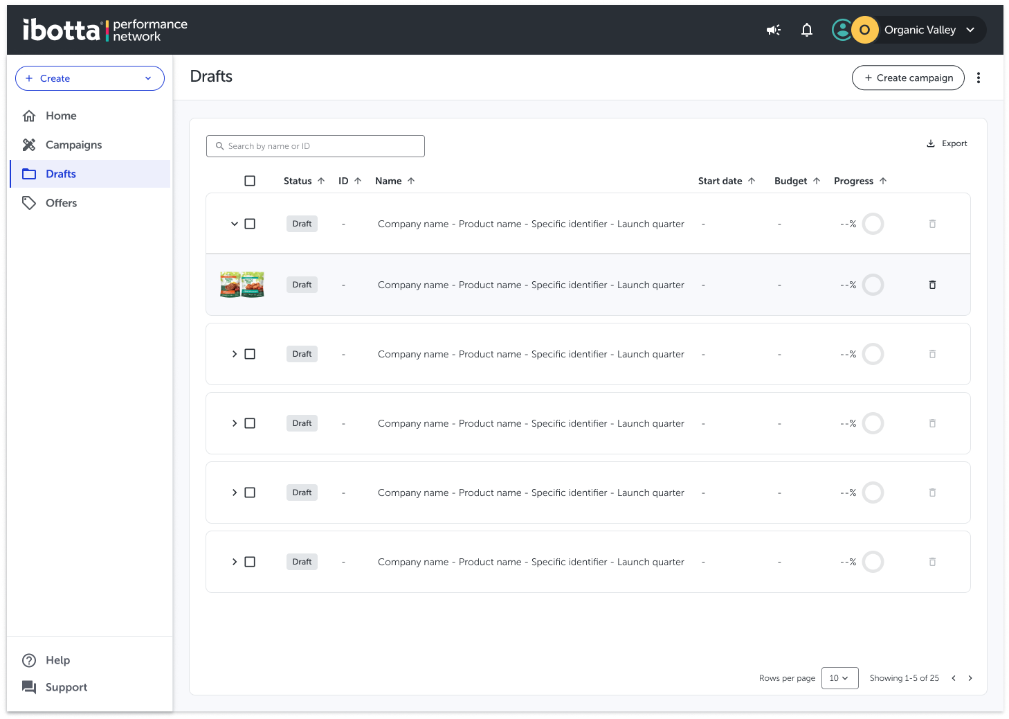
Dedicated Drafts section
Adding drafts to help distinguish between an incomplete campaigns vs. a pending, active, cancelled, or completed campaigns.

Outcomes
The study validated a lifecycle-based information architecture that aligned with user intent across campaign creation, management, and reporting. Structural changes—such as separating Drafts and clarifying navigation labels—reduced ambiguity and improved confidence across priority workflows.
Impact
By grounding IA decisions in research, the work shifted cross-functional conversations from opinion-based debate to evidence-led prioritization. The validated structure unblocked engineering planning, informed naming decisions, and created a scalable foundation for future feature development without compounding navigation debt.
Reflection
Treating IA as a living system—and intentionally deferring unresolved areas—proved more effective than forcing premature alignment, increasing confidence in both the solution and the process.