Hire Path Mobile App
Small Business Hire Tool
In my role as a Senior UX Designer and Design Leader at CareerBuilder, I took the lead in enhancing our mobile app experiences, specifically focusing on a new applicant tracking and hiring app. Recognizing potential gaps in our enterprise offerings and identifying unmet small business user needs, I spearheaded the design of a small business hiring app. This innovative solution provides a budget-friendly avenue for users to access our company ecosystem without the need for a costly subscription or contract. My dedication to refining and iterating towards the best user experience was a driving force in this project.
Initial App & Feature Mapping
Usability and Findability Testing
Our primary goal was to test the usability and findability of this new navigation pattern through a series of open-ended and task based questions.
Participants and Methods
6 Total Participants
All participants were based in North America (US and Canada)
4 men and 2 women between the ages of 23 and 52
Pay ranged from $40k to $100k
Unmoderated user sessions on usertesting.com
Open-ended questions
“What are your thoughts on this type of navigation? Have you seen anything similar to this before, if so, where?”
Task-based questions
“Now go ahead and click where you said you would click. What happened? How did that compare with what you were expecting to happen?”
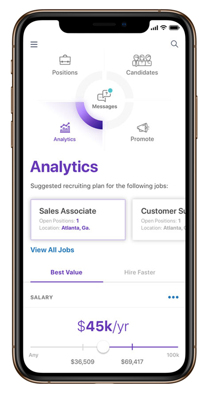
Findings
Content Carousel
There was a level of confusion when users were asked to find applicants who have recently applied to their open positions.
Most users would accurately navigate to the new applicants section within the carousel, but 1/3 of users would navigate to the candidates icon.
This could be contributed to the candidates icon being more visibly prominent and the new applicants section being lower in the content hierarchy.
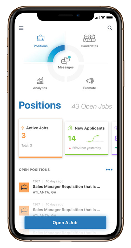
Users were consistently confused on how to return to the active jobs tab on the positions screen.
Users didn’t recognize the carousel tab pattern in the middle of the screen.
This can be attributed to the limitations of the prototype’s functionality and/or the complexity of the test question itself.

“My first instinct was to click on the menu and then hit back.”
“I’d actually click back but I am able to scroll to the left to go back.”

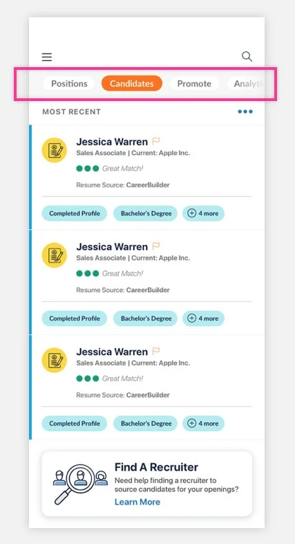
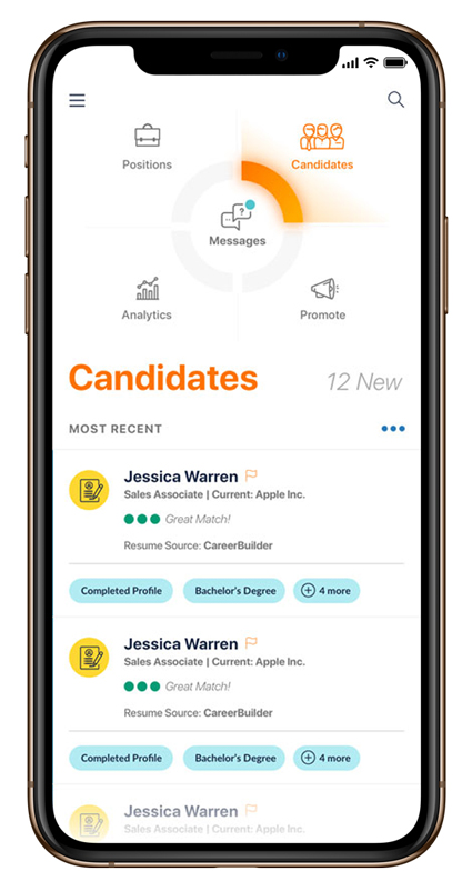
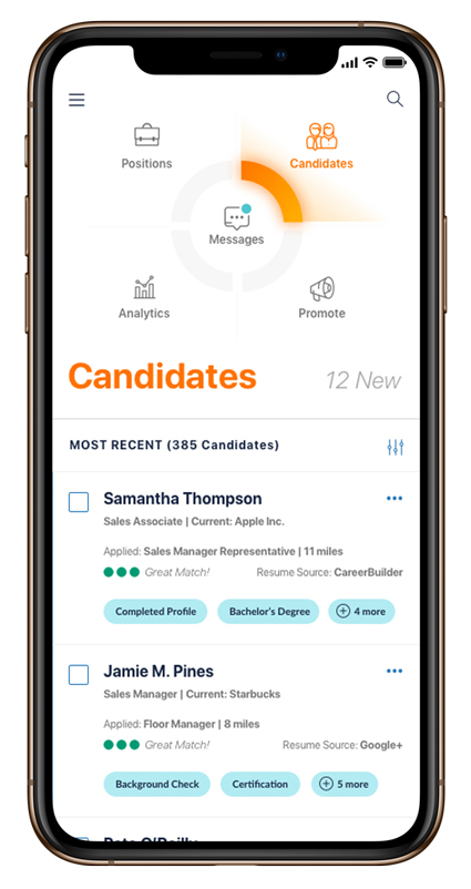
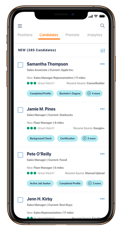
Candidates
All users accurately navigate to the candidates screen to preview a list of all applicants.
Users consistently commented on the amount of content that was being presented within the candidate list.
“I was actually expecting to see less.”
“This is better than I thought because this shows you that this candidate is potentially a good match based on the job and qualifications.”
“What I’m seeing is fantastic. It automatically filters through the candidates for you and tells you which ones are going to be the best match for you.”
Most users were consistently confused by the simplified navigation.
User expects to click the candidates button to return to the larger navigation menu.
Some users associated the mini navigation with a filtering functionality related to the candidate list content.
“I don’t like this feature [mini nav] because I’d like to see something related to the candidates screen and not the whole app.”
New Navigation Feedback
What are your thoughts on this type of navigation? Have you seen anything similar to this before, if so, where?
“I have not seen anything like this before and it looks pretty creative. I don’t mind it, it’s pretty cool and innovative. You might be setting trends for the future.”
“It looks really clean, it looks nice.”
“I like the layout, it’s easy to see, it’s at the top of the page. I don’t have to do a drop down menu. It’s easy and big thumb friendly. I don’t think I’ve seen a layout like this.”
“It doesn’t feel like something I’ve used before, it doesn’t feel the same as anyone else. I do like this kind of navigation, it seems pretty easy to follow and easy to understand. There’s really nothing that got me stumped.”
“Being a moderate user, I’m not a huge cell phone user or into social media, I still think I could pick this up easily and understand what I’m looking at and navigate with ease.”
Written Feedback Highlights
What frustrated you most about this tool?
User1: the tool wasn't frustrating honestly, I enjoyed testing the app. not working directly in HR for a major company some of the terminology was different but it's easily learned.
If you had a magic wand, how would you improve this app?
User2: No ads.
User4: just make it clear how to see all candidates as opposed to the most recent candidate applications. also, make it easy to view each position and click on candidates from there.
What did you like about the app?
User3: Clean design with easy navigation
User5: Very user friendly. Finding things quickly and then having the top layout where you can choose candidates, promote, etc. and not having to use a tiny drop down menu on the phone is a plus.
How likely are you to recommend this app to a friend or colleague (0=Not at all likely, and 10=Very Likely)?
Mean = 8.5 out of 10
Recap and Next Action Steps
Users consistently were able to navigate to sections of the app through the larger top level navigation.
The navigation labeling seems to be spot on and no recommendations for new labels since we were testing with a general usertesting.com audience
Users were confused by the carousel functionality on the home/positions screen but that might be because of the prototype interaction limitations
I recommend that we revisit the carousel functionality, from a design standpoint, to better visual reinforce the desired interactions with the horizontal carousel
The mini navigation needs further exploration since users were confused by the functionality
Mini navigation recommendations include adding the icons from the large navigation treatment, removing the pills, and applying material styles to mimic android navigational functionality
I recommend that we use a more robust prototyping tool to better showcase the various interactions we’re trying to convey in future tests
Further testing of the profile screen to better understand why users are confused by the avatar photo
Get rid of the avatar photo and replace with metrics if we need visual interest
Future tests should be more targeted towards the hr and recruiting audience
Candidates
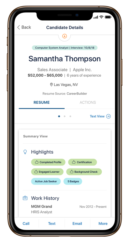
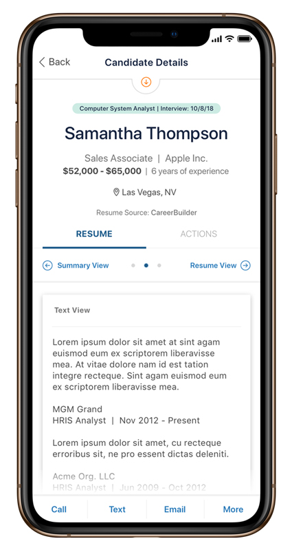
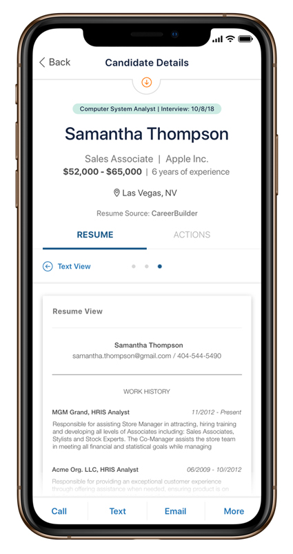
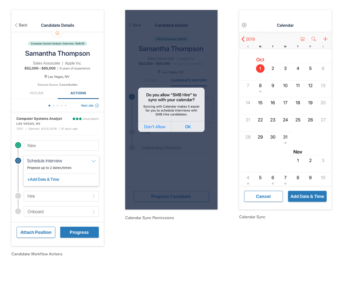
Candidate Details Screen and Workflow Actions

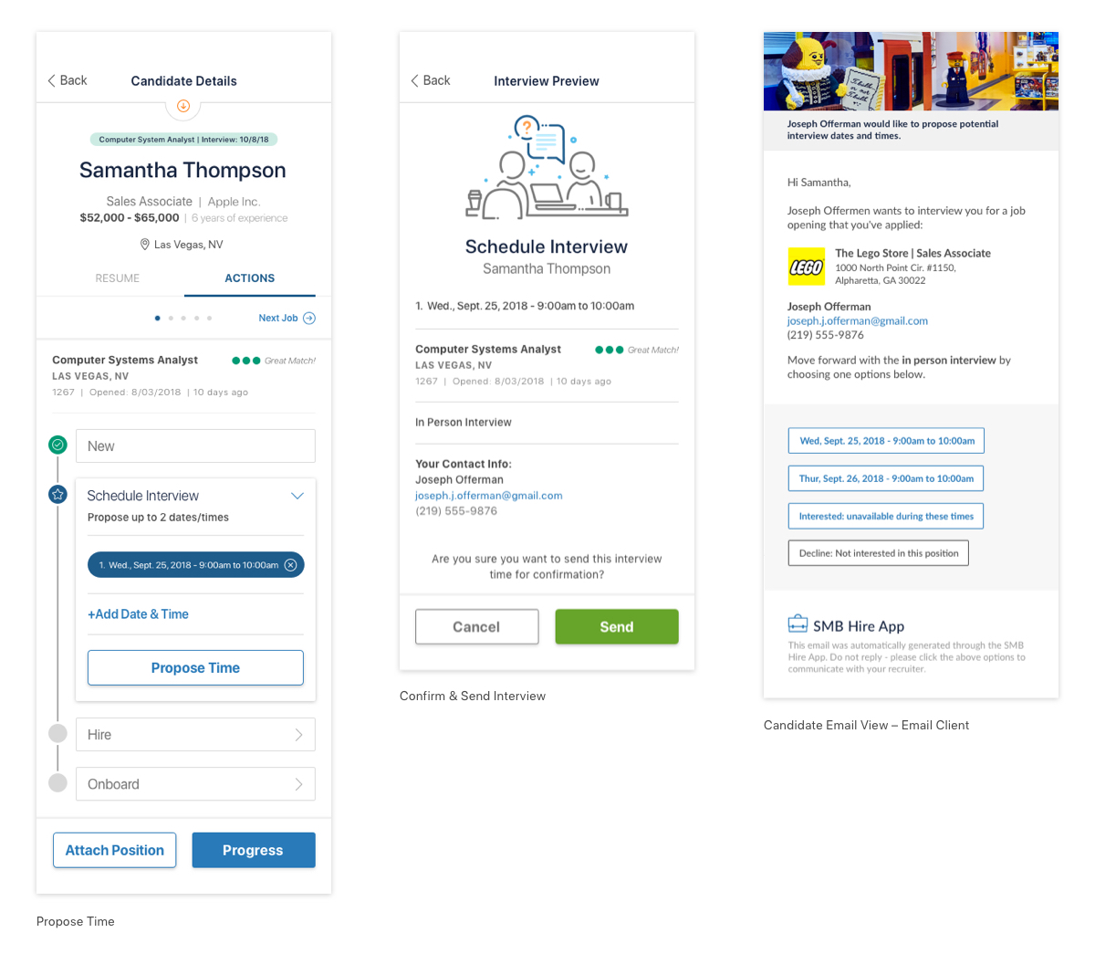
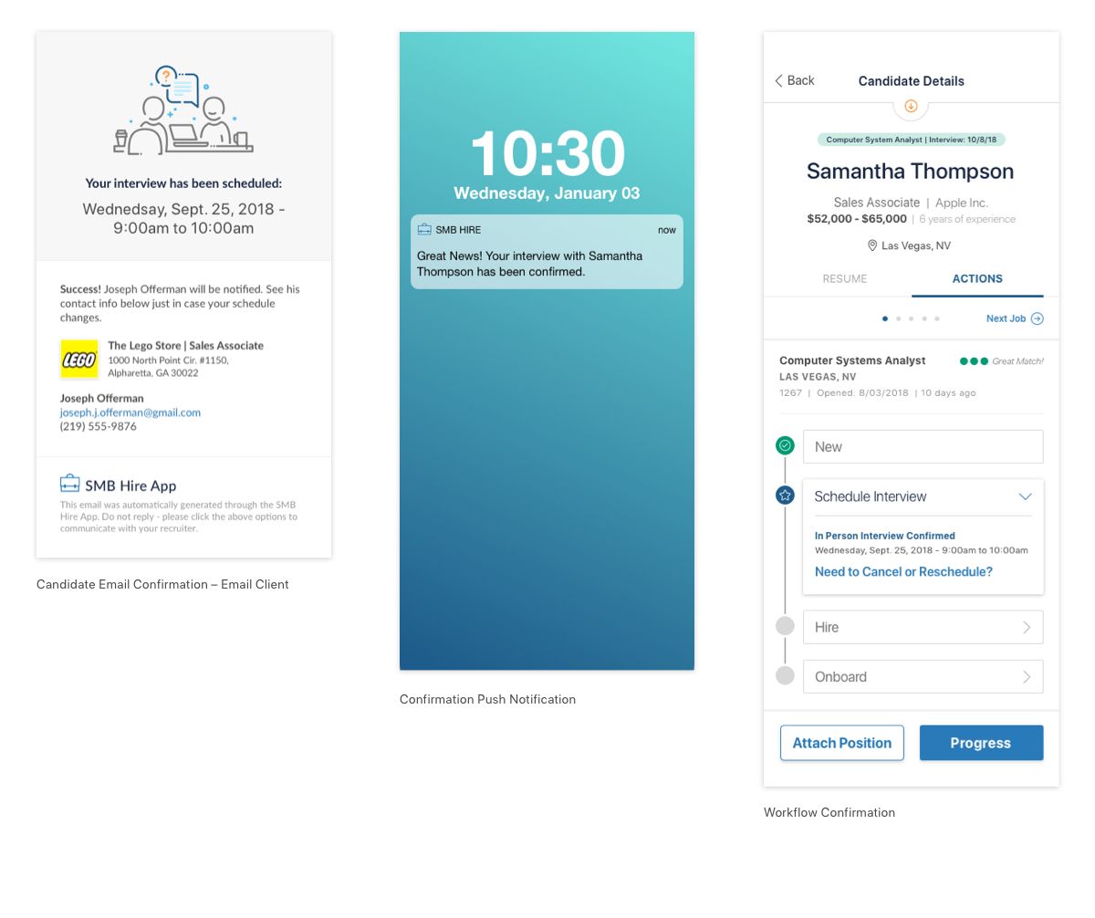
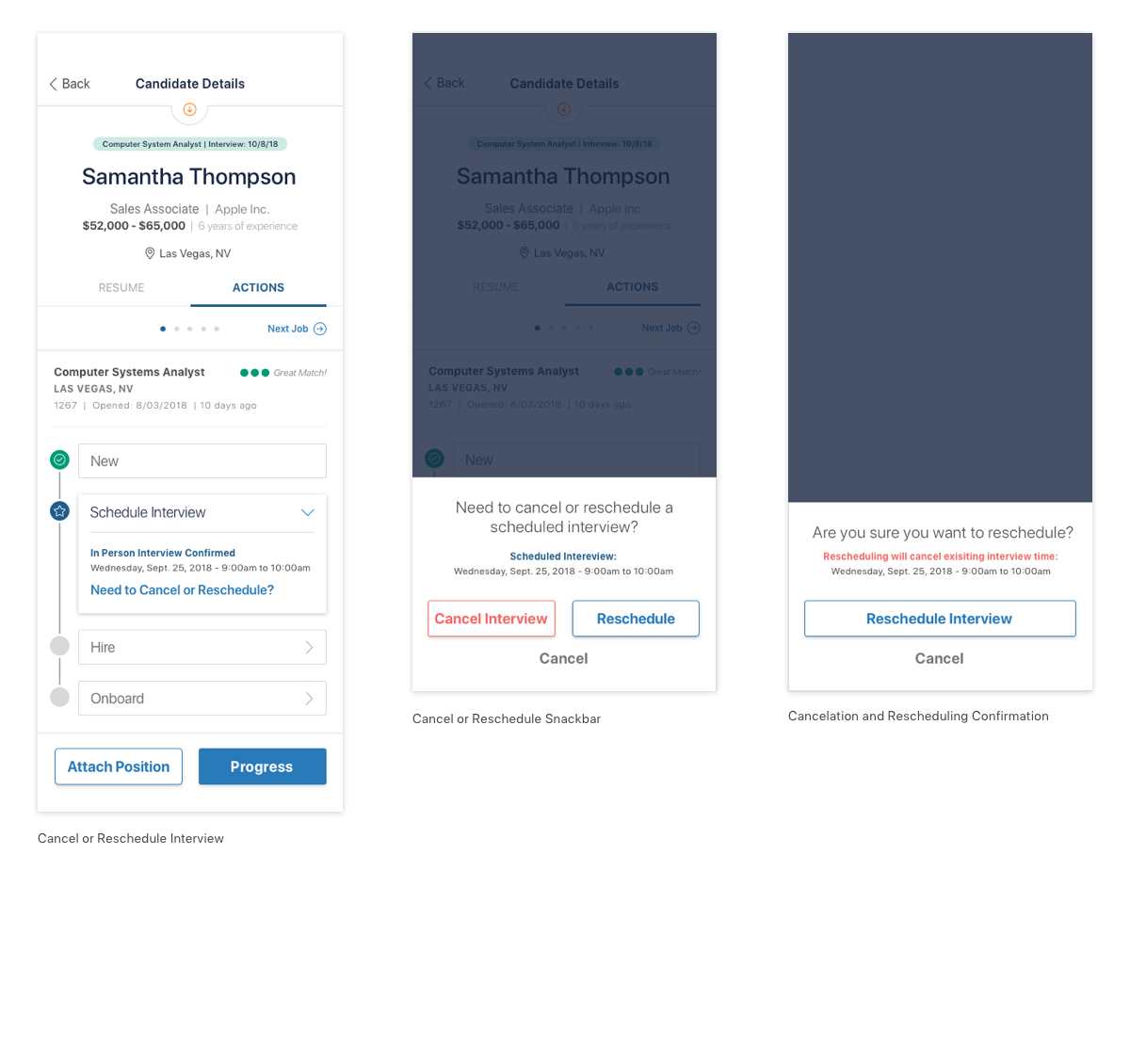
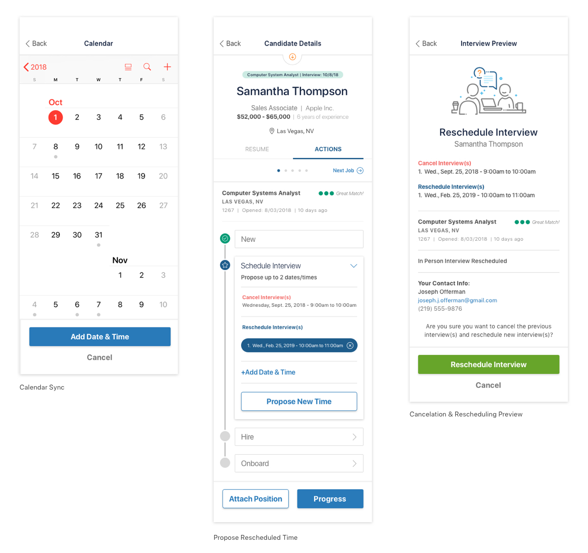
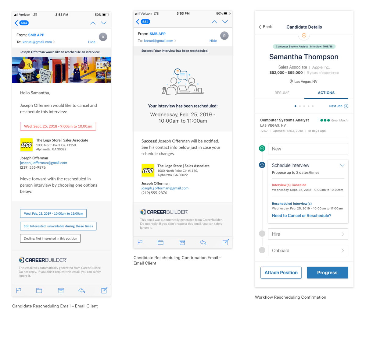
Candidate Workflow – Interview
Schedule Interview Flow
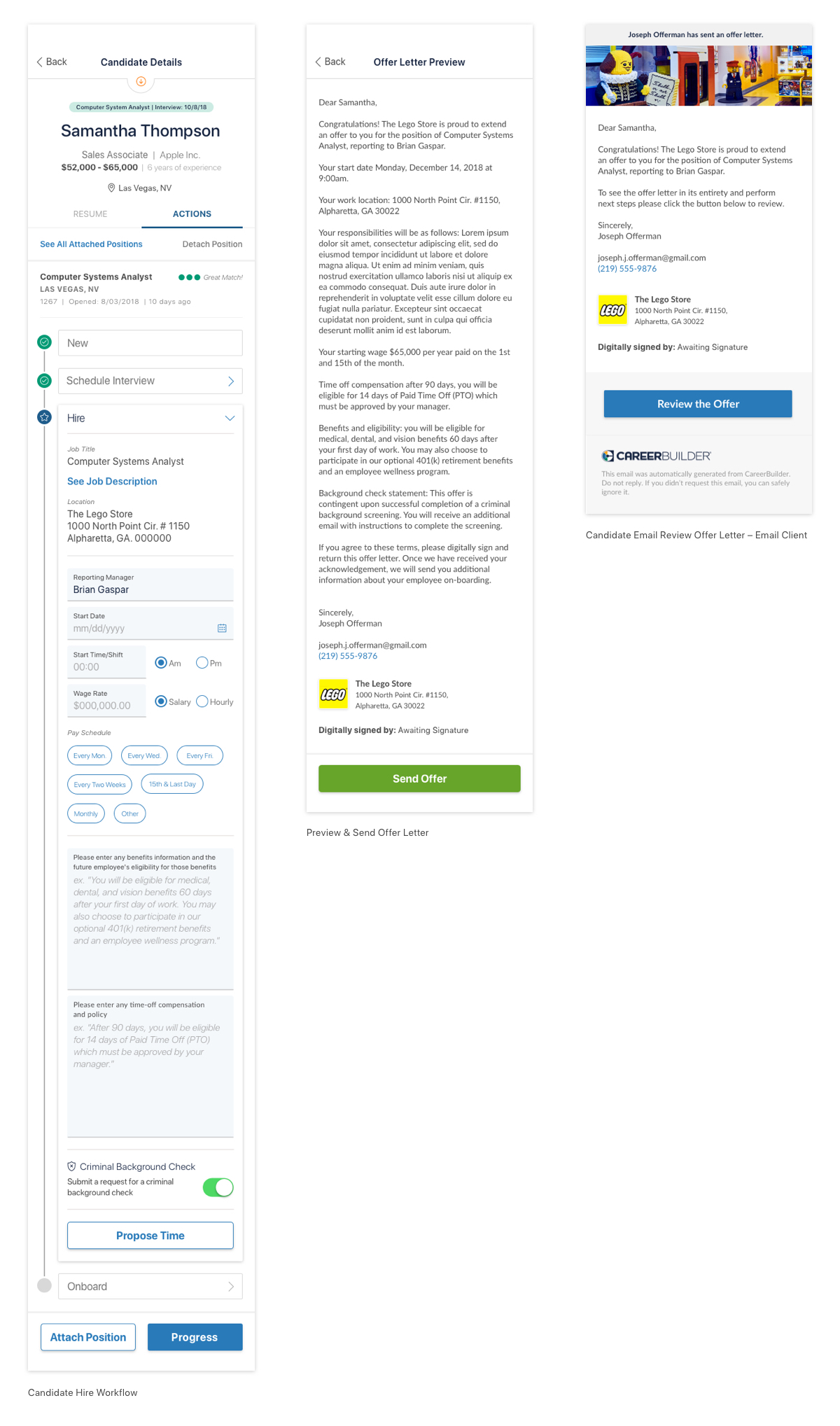
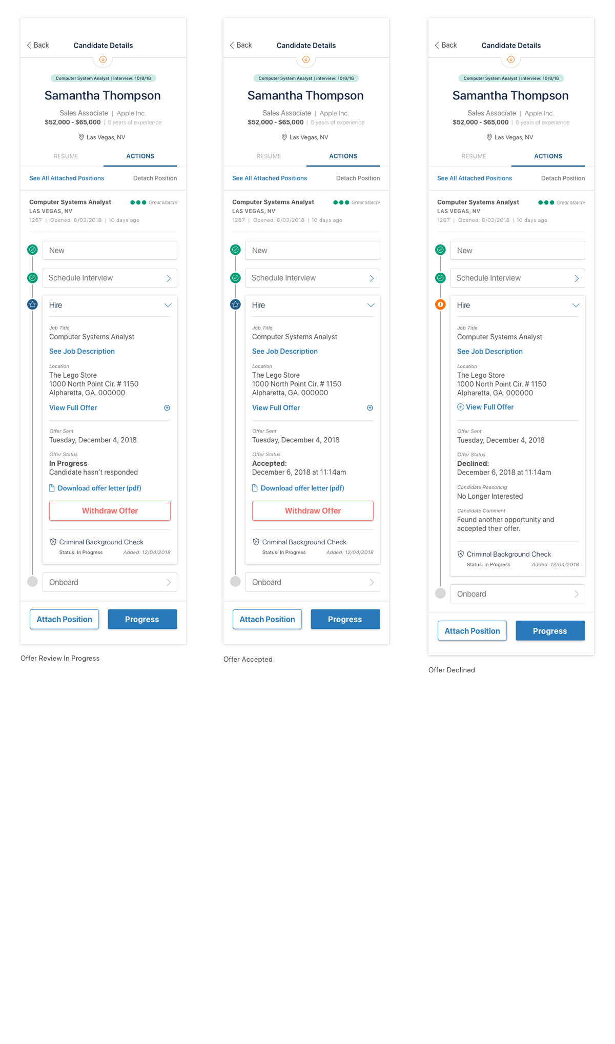
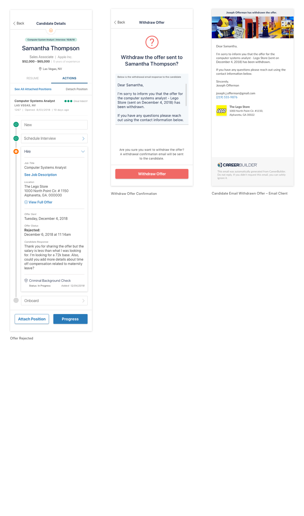
Candidate Workflow – Hire
Hire Workflow
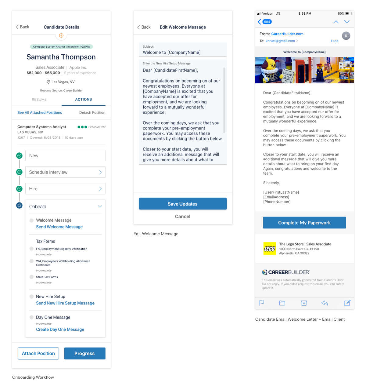
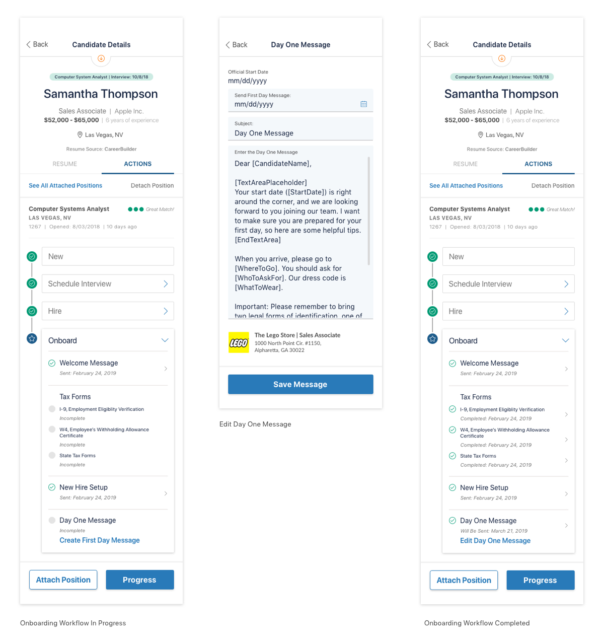
Candidate Workflow – Onboard
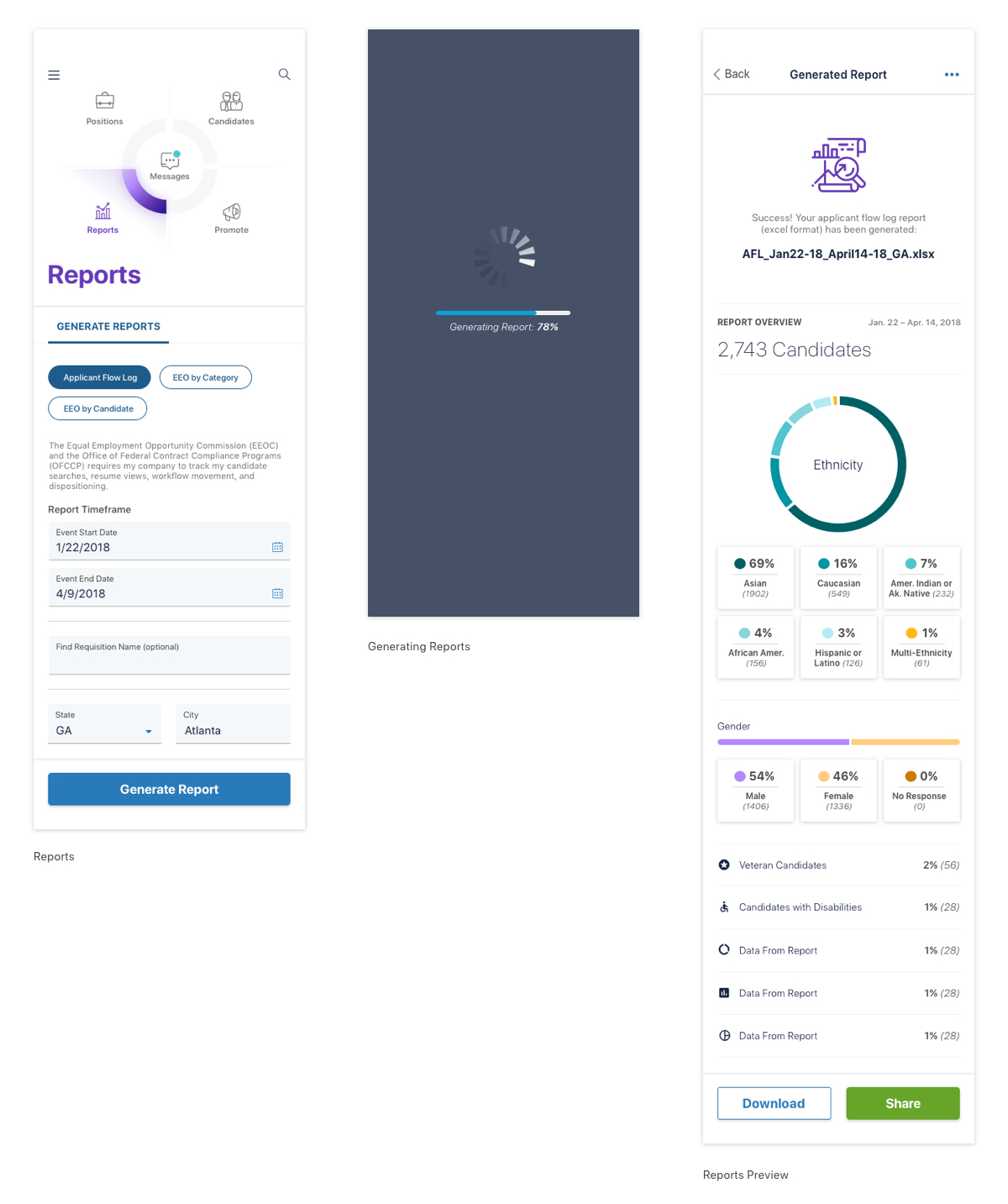
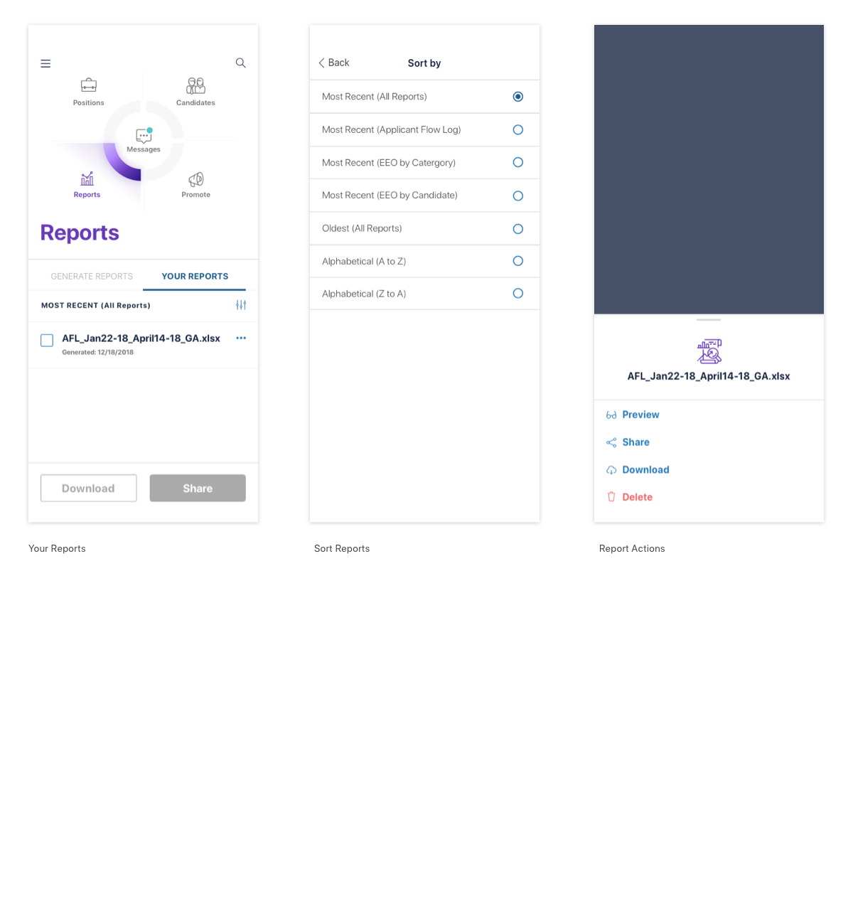
Reporting